March 1, 2022
Build your own landing page in just five steps
Learn how to build your own landing page in just five steps

Build your own landing page in just five steps
For successful online marketing, a landing page is indispensable. It’s an efficient tool for generating new leads and converting these into new customers. Which is why it’s even better that you’re dealing with this topic today.
Creating a landing page can be a challenging task that we are trying to make manageable with this article, conveying our expertise of years of successfully building websites and landing pages. You’ll learn everything you need to know to start right away in just five easily understandable steps. Enjoy the read and the creation of your website.
1. The idea and structure of your website
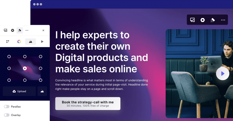
Most landing pages are structured in a similar way and start with the so called “hero- section”. In this section you’ll find a very illustrative graphic giving you the most vital information and a captivating headline. After this you should let people know who you are with the introduction of your company. Describe your products and services, add testimonials as well as a footer with your contact.
At Onepage every section of any given template has already been structured in a logical way, leaving you only with the task of adding your information. If, however you want to customise your site you are welcome to change the given order according to your needs.
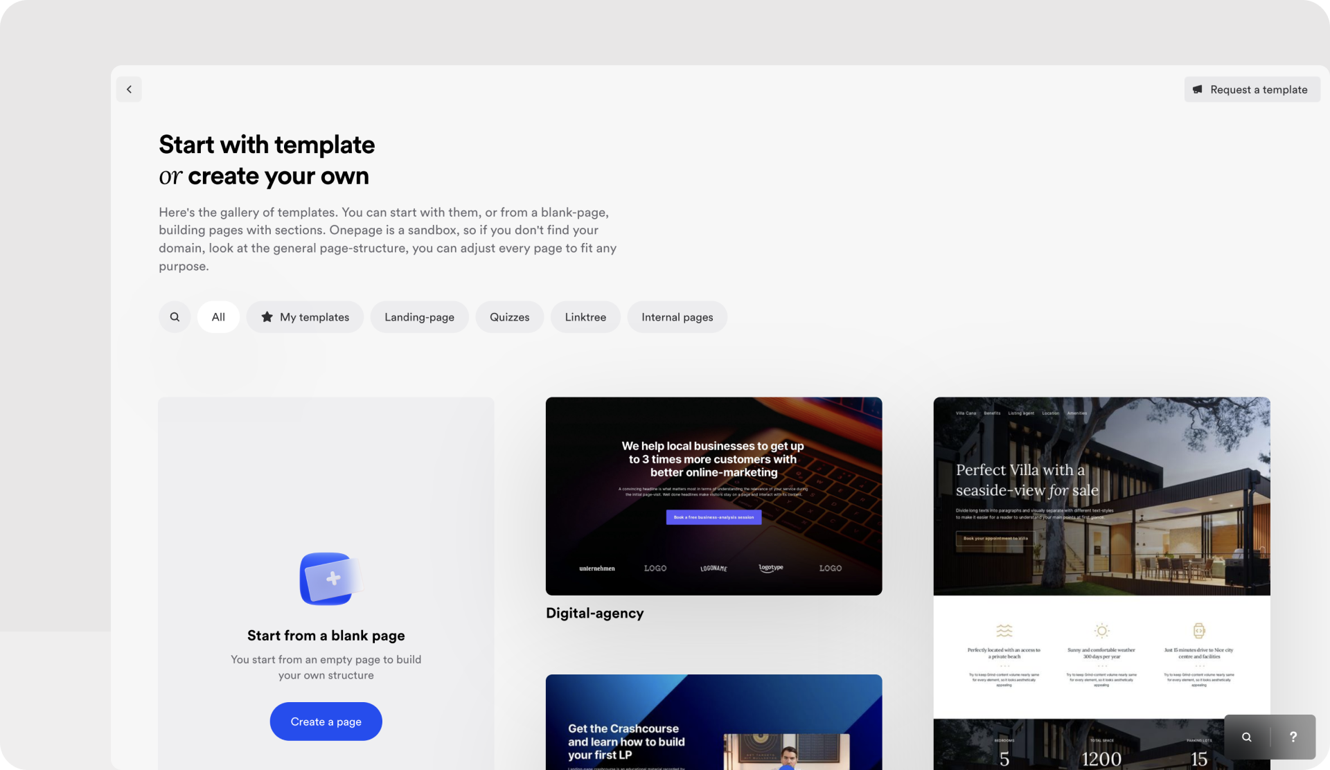
Organise your sections in a logical manner so that the reader doesn’t have any trouble building up a reading flow. Make sure to also give all the relevant information of your product.
An example: Say you have a law firm. The most important elements your landing page should consist of are the information of your offers and the references of customers.
Having said this, it is equally important to find out what differentiates your law firm from others. What is your unique selling point (USP)? This is what you should feature on prominently on your landing page underlining it using fitting images.
Present the projects that are most important and display your expertise in the field. Describe your concept and try emotionally captivating your viewers.
2. What are your competitors up to?
The next step is having a look at what the competition is doing with their landing pages and see if there is anything they do better or worse than you. Use this market analysis to re-evaluate and improve your work.
Perhaps your competitor’s design seems a bit clumsy, but they are still able to attract their target audience. Your goal is to try and understand what makes a difference. Another way of doing it is finding inspiring examples. Even experts with years of experience regularly check out new websites, follow trends and let themselves be inspired by colleagues.
You should understand why you prefer one page to another. Is it the colours of the design, the images, the structures? In order to get a better feel for what you like and need it might be advisable to visit websites of entirely different industries.
3. The right content
Now that the structure of your site is fixed let’s get started on the written texts. Where do you get them from and what do you need to be aware of?
There are multiple options to go about this: you can write them yourself, ask an employee or transfer the task to a freelancer.
Writing appealing texts for your website: Should you choose to write your text yourself consider these rules:
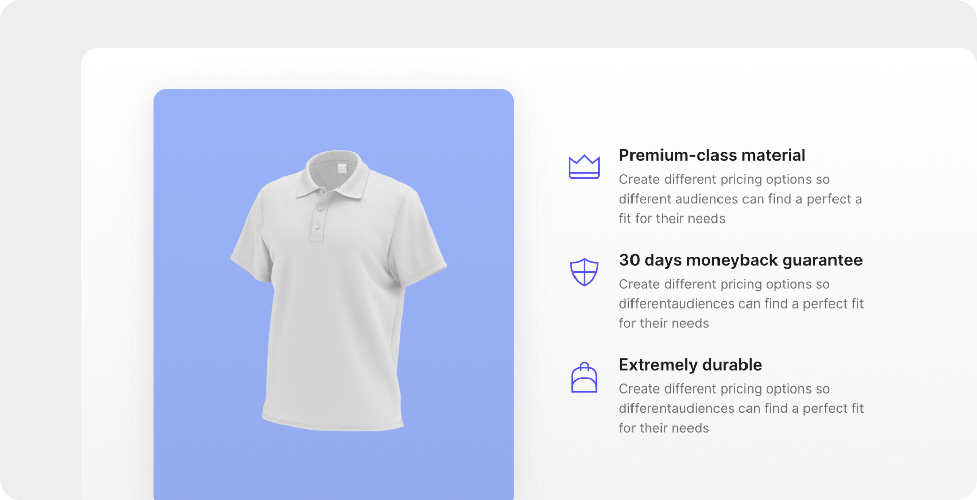
Describe your benefits: What’s your USP? What do you do better than others and what benefits does your customer have by choosing your offer? Answer these questions on your landing page being as precise as.
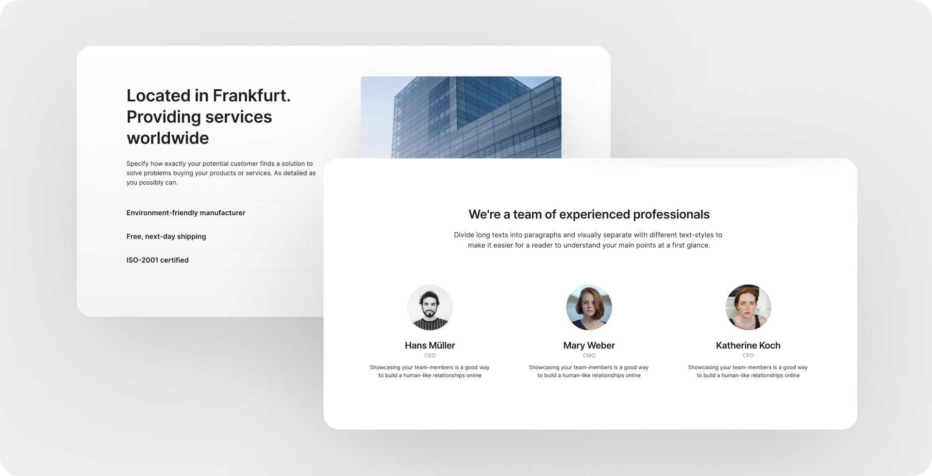
The “about us” section: This section is a great opportunity to introduce yourself and your company more closely. Use this personal insight to create an emotional bond with your reader and share more about who you are and where you came from. What motivation has gotten you to where you are?
The headline: The header is of immense importance. It is a deciding factor for the visitor to either read the text or shut the window. Try engaging your reader right away. Read the blog article on “how to write a landing page text” to learn more about formulating captivating headlines.
The social proof for more trust: Social proof is what the rating of other users is called. About 82% of consumers read online reviews before purchasing a product. Another part of social proof would be certificates and awards. Include these elements of social proof under any circumstances to promote trust and proximity. Onepages offers you templates that let you integrate your customers feedback on your landing page with ease.
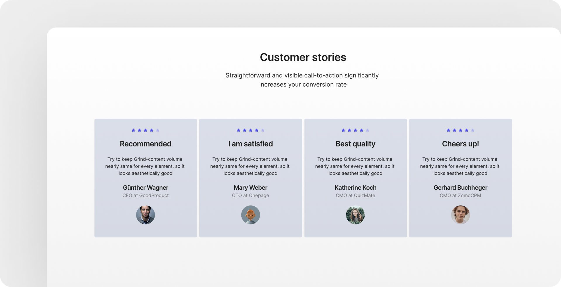
Use a personal approach: Talking to your readers directly is the easiest way to create a bond with them which should always be a priority:
“This is how one loses three kgs in five days” or “This is how you lose three kgs in five days”. Addressing your reader directly makes them feel involved and helps them relate to your content.
4. The Call-to-action-button (CtA)
Another important part of your landing page are the CtAs without which no conversion can exist on your website. The “Call-to-Action” is the easiest way of engaging your visitors. You let them what to do. As a company you’re in constant competition for the attention of your viewership CtA buttons play a decisive role here since they can encourage your viewers to act in a favourable way.
What to consider when creating CtA buttons: They should easily grab your readers attention and contain a clear “Call-to-Action”. Use language directed at your viewers here as well. For instance, “Apply for this seminar”. The button should be distinguishable from the rest of your landing page by colour and indicate what the user will encounter after clicking on it.
Position your buttons at the bottom of a section and keep the following order: Headline, Text and then the CtA button. Be mindful of a good reading flow.
5. The design
On Onepage designing your site begins with a choice of a fitting template. Alternatively, you may also start from scratch. While every template is optimised for maximal conversion, you won’t be restricted in any way and easily will be able to customise them when filling them with your content.
Cover: The cover is the first impression your viewers will get of your company, making it very important. Choose a high-quality image and a captivating headline.
Images: Where can you get “good” images? Professional images convey reliability, promote trust and create emotional bonds with your viewers. Although Onepage offers a great selection of pictures of the Unsplash-library we would recommend using real pictures of your team and your business, stressing the personal bond to your visitors.
Fonts: Usually one font is sufficient for your website and demonstrates a coherent and professional overall impression. If it fits you may also work with two contrasting fonts.
Colour of fonts: The same rule that applies to your font itself also applies here: Less is more. Choose a colour pallet and ensure that it befits you and your company.
Once you have completed the design look at your landing page, review it and correct potential errors.
Last Steps…
Almost done! There are only a few details before your website can go live:
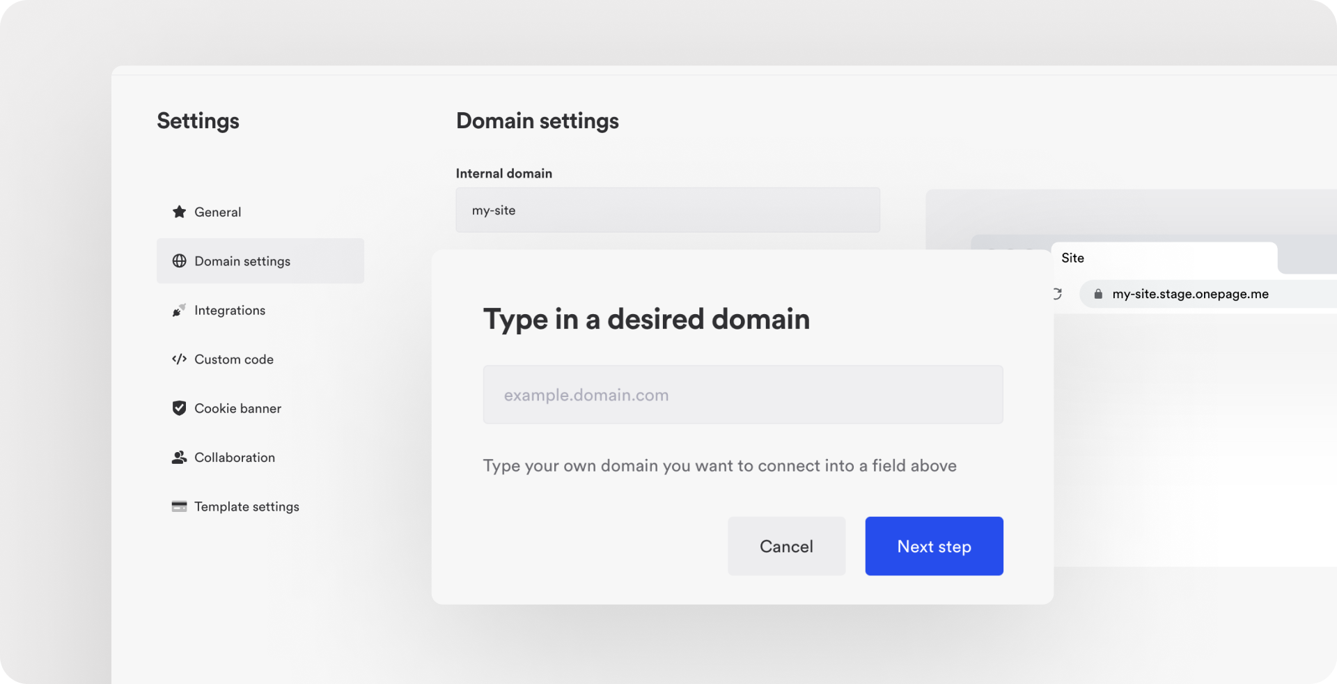
Link it to your domain. To do this go to the site’s settings on Onepage and type in the name of your domain.
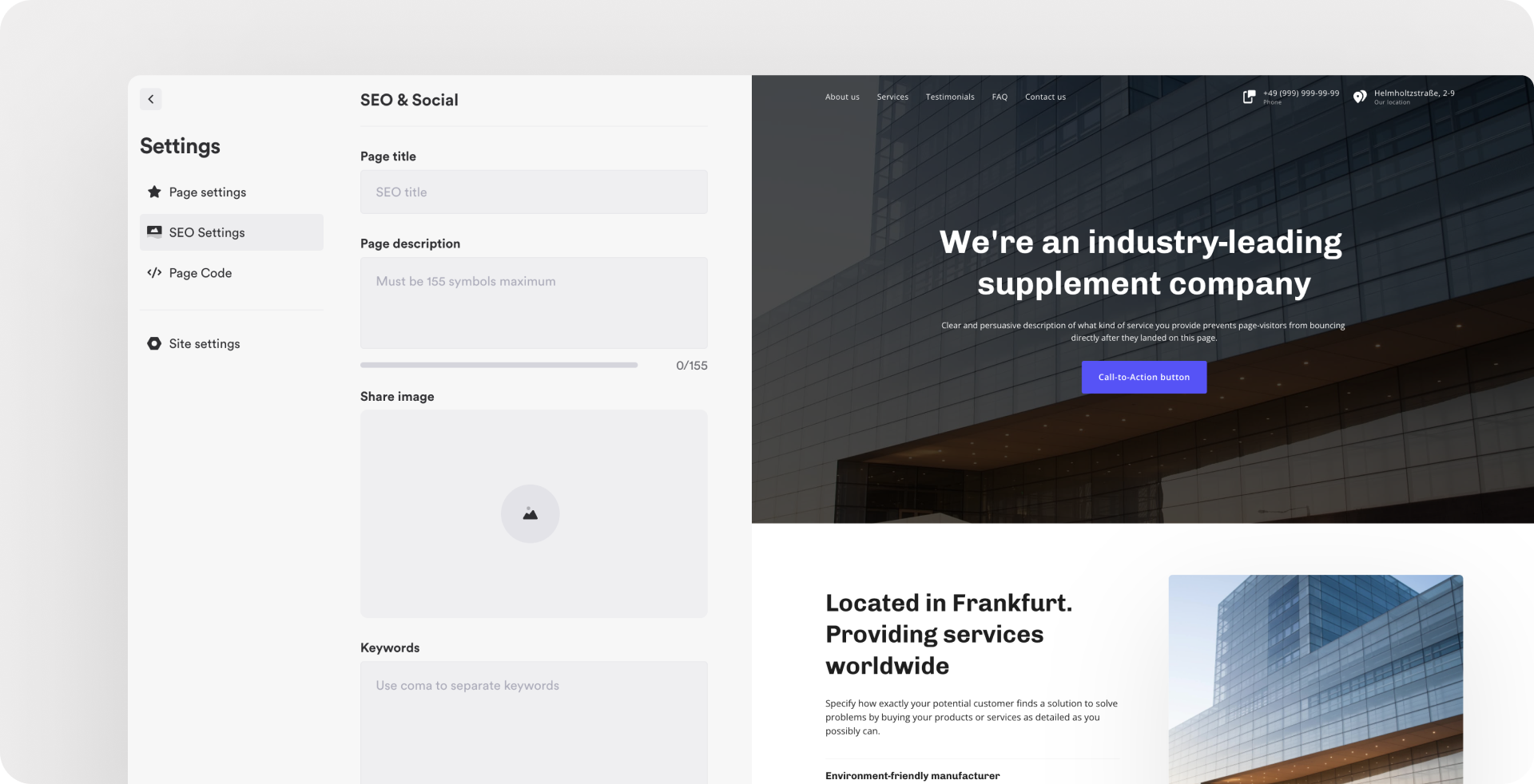
Activate the SEO settings to make sure that you are seen on search engines. In addition to the meta title and description, Onepage lets you add an image and determine relevant keywords so you can be found online.
You’ve finally made it: Click on publish. Your web page is now ready for its first visitors. To generate as much traffic as possible, promote it on all your social media accounts. Lastly have your site evaluated by family, friends, and good customers. Ask them for feedback and see how you can improve your site.
Now it’s your turn! You have learned all the important steps of creating a landing page.
No software has ever made it easier to get your business online. On top of that it is completely free of charge- We’re looking forward to seeing you!
Start with
Onepage for free.
It’s fast and enjoyable
Onepage is free to use. It’s not a trial version.
No credit card is required
