August 10, 2023
Creating landing pages that convert (Guide)
Guide to creating compelling landing pages that convert visitors into paying customers
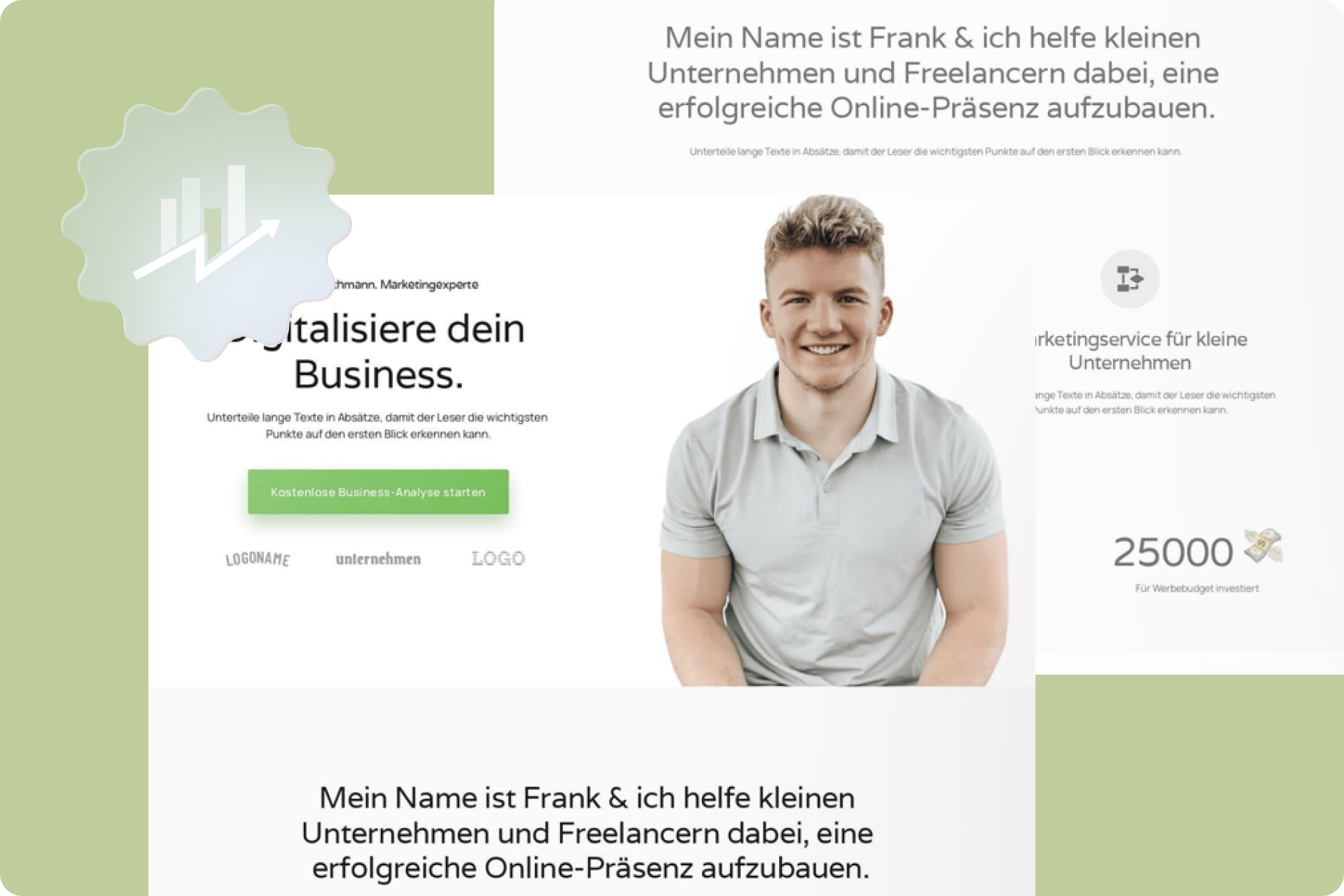
A compelling landing page is the key to turning visitors into paying customers. It is the first point of contact where potential customers engage with your offer. To ensure your landing page is effective, it needs to be divided into two parts: the visible section (Above the Fold) and the scrollable section (Below the Fold). Both areas play a crucial role in capturing visitors' interest and prompting them to take desired actions.
In this article, we aim to provide you with a comprehensive and detailed step-by-step guide that will help you create landing pages that truly convert. You will learn how to strategically utilize the different elements of a landing page to convey the value of your offer, build trust, and encourage visitors to take the desired action.
From crafting an engaging headline and memorable subtitle to visualizing your product or service effectively and leveraging social proof and call-to-action buttons, each step in this guide has been designed to unlock the full potential of your landing page.
Whether you have prior experience in creating landing pages or are just starting out, this guide will help you optimize your landing page and transform more visitors into paying customers. Are you ready to increase the conversion rates of your landing pages? Let's get started and turn your landing pages into effective sales tools!
Above the fold
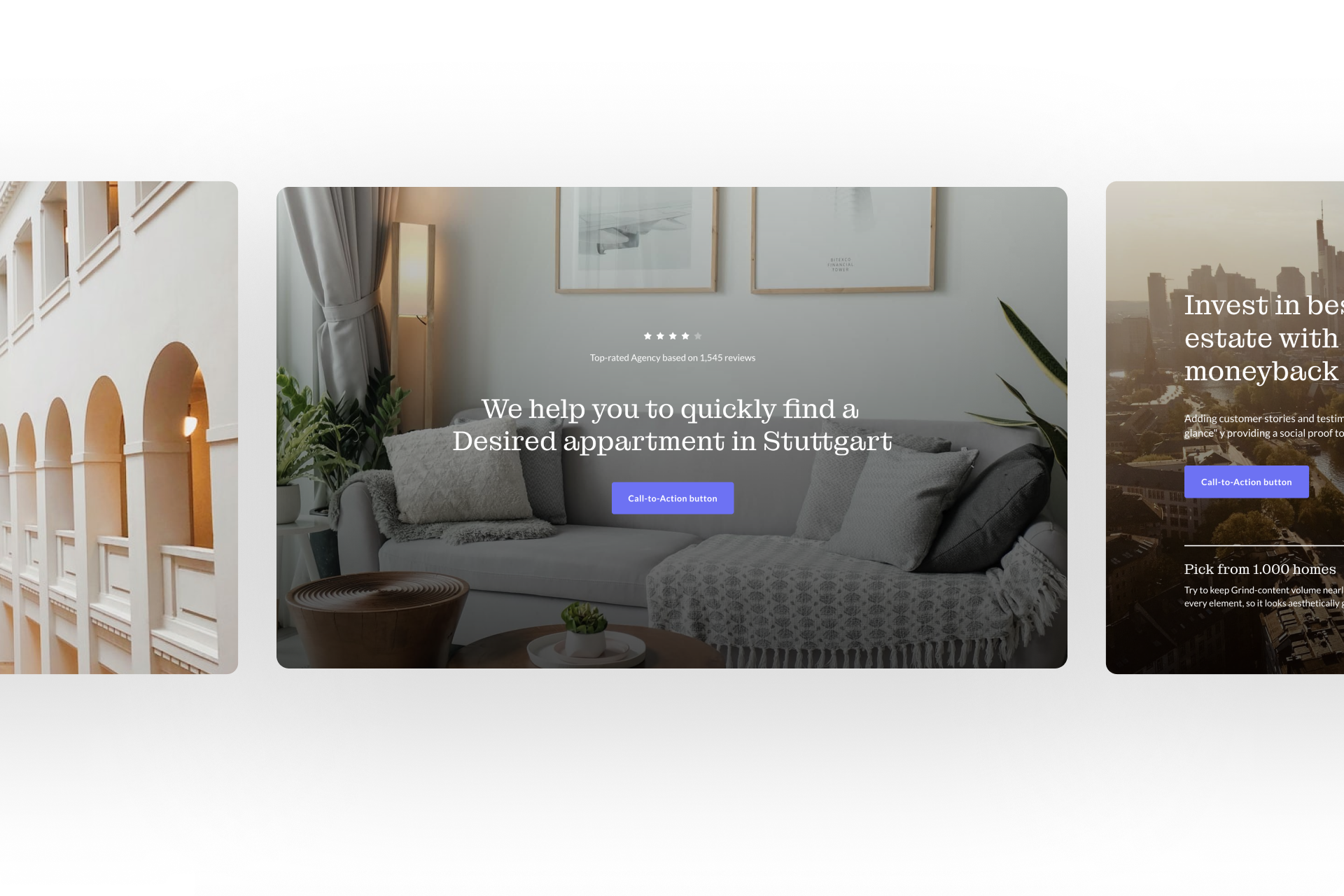
The visible section of your landing page, also known as "Above the Fold," plays a crucial role in capturing the interest and attention of visitors. It is the first impression they get of your offer, and therefore, it is essential to design this area effectively to motivate them to continue reading and ultimately take the desired action.
Whether you are creating a new landing page or looking to optimize an existing one, the tips and strategies in this section will help you effectively craft the Above the Fold section and capture visitors' attention right from the start. So let's delve deeper into each element and learn how to transform the visible section of your landing page into a compelling and conversion-focused area.
Title:
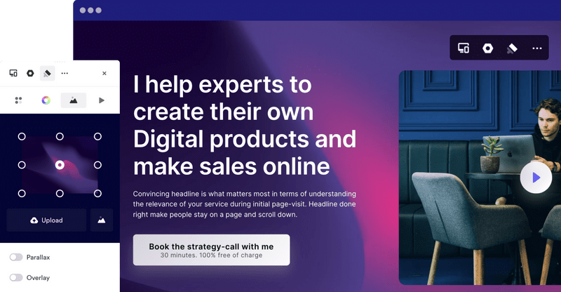
The title is the centerpiece of your landing page and has the task of immediately captivating visitors and conveying its value. When creating a landing page, there are various approaches you can take to craft a compelling title that grabs visitors' attention and piques their interest.
- Explain what you do: If your product or service is unique, you can use the title to clearly and succinctly explain what you do and the benefits it provides to the customer. Keep it simple and avoid technical jargon to ensure that visitors immediately understand what you are offering.
Example: "The revolutionary solution for effective time management"
- Hooks: If your product or service is not unique, you can use a hook, an engaging slogan, to capture visitors' attention. A hook should address the biggest hurdle or objection of your target audience and demonstrate that you have the solution.
Example: "Boost your productivity and overcome the time crunch"
- Dominate your niche: If you operate in a specific niche, you can position yourself as THE solution for that specific problem. Give your statement conviction and show that you are the best solution for this particular target audience.
Example: "The #1 source for premium organic food straight from the source"
By choosing a compelling and persuasive title that clearly communicates the value of your offering and addresses the interests and needs of your target audience, you can pique visitors' interest and motivate them to read on and learn more about your offer. Remember, when creating a landing page, the title is the first opportunity to convince visitors of the relevance and benefits of your offer.
Subtitle:
When creating a landing page, the subtitle plays an important role in providing visitors with precise information about your offer and clarifying how you will deliver the promised value. It gives you the opportunity to delve into the details and further convince visitors. Here are some tips on how to effectively craft your subtitle:
- Be precise and specific: The subtitle should be concise and clearly formulated. Avoid overly general statements and instead focus on the specific features or benefits of your product or service.
Example: "Accelerate your e-Commerce success with automated inventory management"
- Highlight uniqueness: Emphasize in the subtitle what sets your offer apart from others and the added value it provides. Show visitors why your product or service is the best choice.
Example: "The only project management software designed specifically for creatives"
- Emphasize problem-solving: Clearly illustrate how your offer can solve visitors' problems or challenges. Show how you fulfill their needs and help them achieve their goals.
Example: "Boost your fitness and achieve your goals with customized workout plans"
By strategically using the subtitle to communicate the key features or benefits of your offer and clearly conveying to visitors how you meet their needs, you can further increase their interest and motivate them to learn more about your offer. Remember, the subtitle provides another opportunity to highlight the value of your offer and prompt visitors to take action.
Image:
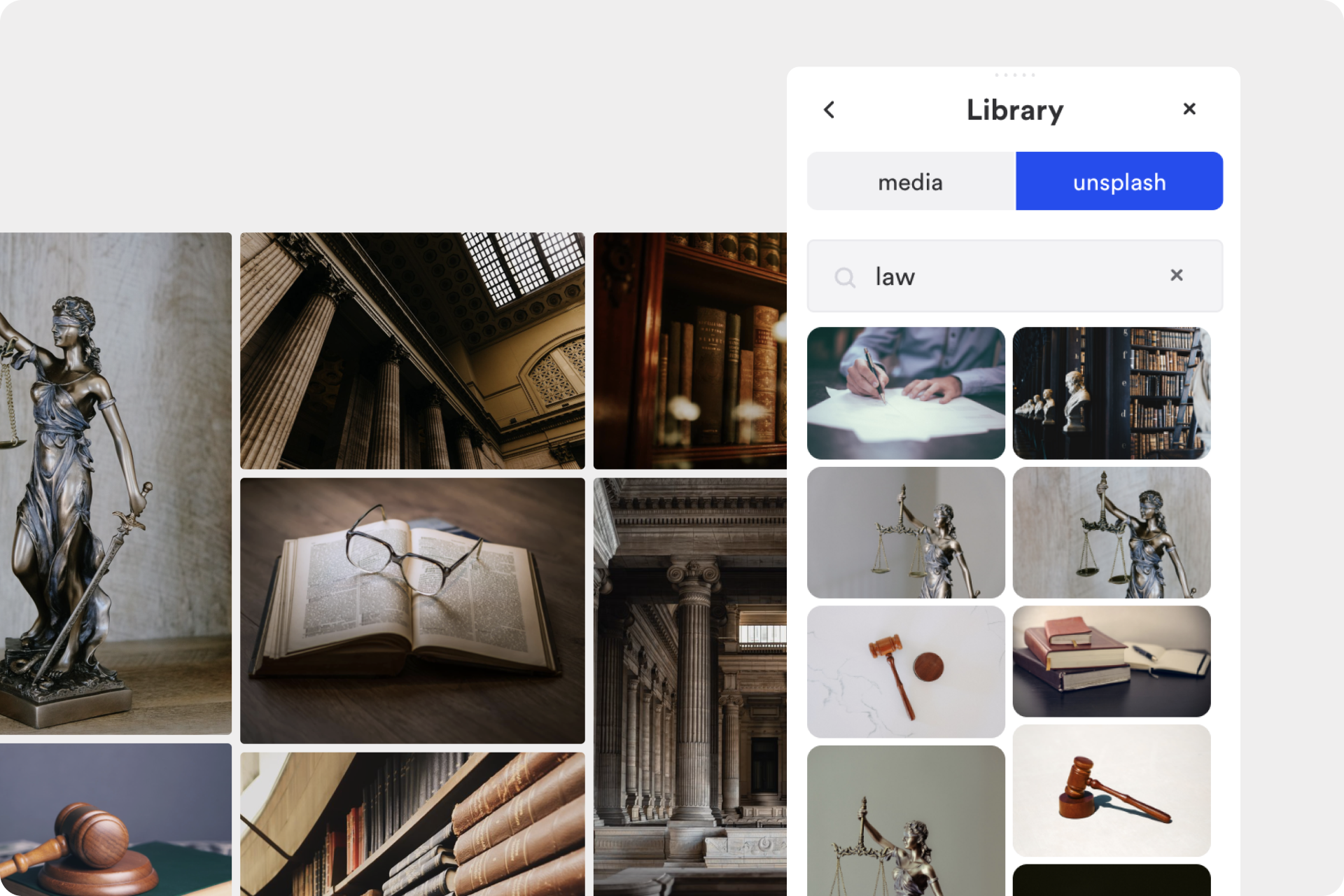
The image you use on your created landing page plays a crucial role in helping visitors envision how your product or service will benefit them. A compelling image or a short video showcasing your offer in action can convey a powerful visual message and capture visitors' interest. Here are some tips on how to effectively utilize the image:
- Realistic representation: Avoid excessive illustrations or generic images. When creating a landing page, show the actual product or the real application of your service. This allows visitors to better visualize how the offering will work in their lives.
Example: If you offer a fitness app, show an image of people actually using the app and achieving their fitness goals.
- Depict action and benefits: The image should showcase the product or service in action and highlight the benefits that visitors can derive from it. It should emphasize the advantages and results they can expect.
Example: If you sell a kitchen appliance, display an image of someone using it to prepare a delicious meal, illustrating the utility and functionality of the product.
- Appeal to emotions: Use images that evoke emotions and establish a connection with visitors. Emotional reactions can influence purchasing decisions and heighten visitors' interest.
Example: If you're promoting a travel package, use an image of a happy couple relaxing on an exotic beach, evoking the desire for an unforgettable vacation.
Note: Also, check out our article “Create your website: A guide to achieving successful website design" for further insights.
Social proof:
When creating a landing page, social proof is a crucial element to include in order to gain visitors' trust and demonstrate that others have already benefited from your offer. By showcasing testimonials, reviews, or numbers, you establish credibility and increase the likelihood that visitors will trust your offer and make a positive purchasing decision. Here are some ways you can effectively utilize social proof:
1. Testimonials: Display authentic statements from satisfied customers who share their experiences with your product or service. Use real names and, if possible, include pictures to strengthen credibility.
2. Reviews and star ratings: If you have customer reviews or star ratings from reputable platforms such as Google, Trustpilot, or Yelp, feature them on your landing page. This allows visitors to see that others speak positively about your offering.
3. Case studies and success numbers: Share specific success examples or numbers that demonstrate how your offering has helped others. If possible, present data and facts that support the effectiveness and benefits of your offer.
4. Media presence and awards: If your offer has been mentioned in the media or received awards, showcase this on your landing page. This builds trust and demonstrates that your offer is recognized by experts.
5. Figures and statistics: Utilize impressive numbers or statistics to illustrate the results or benefits of your offer. For example, you could showcase the number of satisfied customers, units sold, or the growth of your business.
By presenting social proof, you show visitors that others are already convinced of your offer and have had positive experiences. This builds trust in your brand and makes them more inclined to make a purchasing decision. Social proof is a powerful tool to strengthen the credibility of your landing page and increase conversion rates.
Call to action (CTA):
The Call to Action (CTA) is the crucial step on your created landing page to prompt visitors to take the desired action, whether it's making a purchase, signing up, or contacting you. It's important to design the CTA in a prominent and clear way to capture visitors' attention and motivate them to take action. Here are some tips for effectively designing your CTA:
1. Eye-catching design: The CTA should visually stand out and differentiate itself from other elements on the page. Use a striking color, larger font size, or unique placement to draw visitors' attention to the CTA.
2. Use active verbs: Employ active verbs in the CTA to generate a sense of urgency. Instead of using "Learn more," consider using phrases like "Discover now" or "Secure your offer." Active verbs create a stronger call to action and motivate visitors to click.
3. Emphasize the value: Communicate the value that the user will receive when they click on the CTA. Highlight the benefits, solutions, or outcomes they can expect. By doing so, you create an incentive and show visitors why it's worth responding to the CTA.
4. Alternative CTAs: Offer alternative CTAs that address specific objections or needs of the visitors. For example, if you have a paid offering, you could provide a CTA for a free trial or demo version. This allows visitors to choose different options that better suit their needs.
5. Clear and concise text: Ensure that the text in the CTA is clear and understandable. Avoid long or confusing sentences. The text should immediately tell visitors what they should do and what action is expected.
By following these tips, you can create an effective and compelling CTA that encourages visitors to take action on your landing page. A well-designed and strategically placed CTA can significantly increase conversion rates and drive desired outcomes.
Below the fold
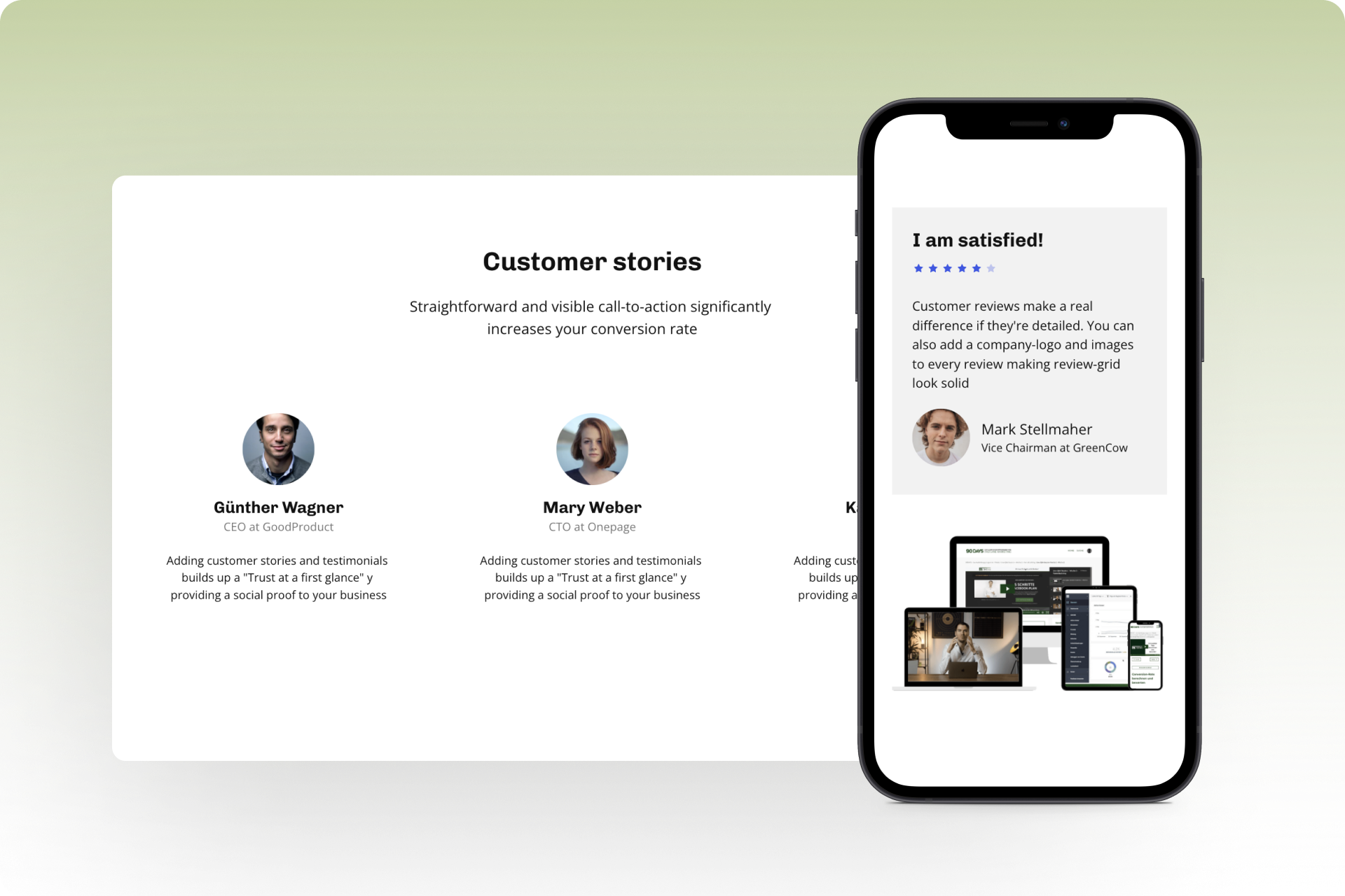
Once visitors have scrolled past the visible area of your landing page, you enter the "Below the Fold" section. Here, you have the opportunity to utilize additional compelling elements to continue captivating visitors and motivate them to take the desired action.
By strategically leveraging the Below the Fold section, you can provide visitors with supplementary information to strengthen their purchasing decision and increase their willingness to take action. You can further emphasize the value of your offer, address any concerns they may have, and provide additional opportunities for interaction. Use this section to guide visitors through the entirety of your landing page and provide them with all the necessary information to make a positive decision to take action.
Here are the key elements you can incorporate in the Below the Fold section of your created landing page:
Features and objections:
The Below the Fold section provides you with an opportunity to make the promised value of your offer even more concrete and tangible. Here, you can highlight the key features and benefits of your product or service while also addressing common objections. By leveraging customer feedback, you can address their concerns and strengthen the trust of your visitors.
- Features:
Present the main features and functionalities of your offer to give visitors a clear understanding of what it can do and the benefits it provides. Explain how your product or service meets the needs of visitors and helps them solve their problems or achieve their goals.
- Objections:
Address common objections or concerns that visitors may have and demonstrate that you take them seriously by providing solutions. Utilize customer feedback to identify these objections and address them directly. Show that you understand their concerns and have taken steps to accommodate them.
- Customer feedback:
When creating a landing page, leverage testimonials, reviews, or customer testimonials to build trust with visitors and address their concerns. Demonstrate that others have had positive experiences with your offer and have benefited from it. Use real names, images, and, if available, quotes to enhance the credibility of customer feedback.
More social proof:
In the Below the Fold section, you can further leverage social proof to motivate visitors to take action and strengthen their trust in your offer. You can incorporate various forms of social proof, such as customer reviews, testimonials, or case studies, to substantiate the value of your offer. By including more social proof in the Below the Fold section, you enhance visitors' trust in your offer and demonstrate that others have already had positive experiences.
Here are some ways you can incorporate more social proof on your landing page:
- Customer reviews:
Present authentic customer reviews that highlight the positive experiences and results your customers have had with your offer. Show names, images, or other information that adds credibility to the reviews. Through customer reviews, visitors can see that others have already benefited from your offer and achieved positive results.
- Testimonials:
If possible, showcase testimonials from well-known personalities, industry experts, or influencers who can further strengthen your credibility. When recognized individuals endorse or have had positive experiences with your offer, it increases visitors' trust and motivates them to respond to your call to action.
- Case studies:
Create case studies that provide concrete examples of the success and results achieved with your offer. On your landing page, showcase detailed information on how you have helped customers achieve their goals or solve problems. Utilize compelling data, graphics, or charts to illustrate the positive impact of your offer.
FAQ:
There will likely be unanswered questions and specific information that you couldn't incorporate in the visible area.
In the Below the Fold section, you have the opportunity to address frequently asked questions (FAQs) and alleviate any concerns visitors may have. It's important to utilize this section on your created landing page to provide additional information that couldn't fit in the visible area. Here are some points to consider when designing your FAQ:
- Identify frequently asked questions: Analyze customer feedback, consult with your support team, or utilize online forums to identify the questions and concerns visitors may have. Determine what information they might be missing or what doubts they may have.
- Answer questions precisely and clearly: Formulate the questions and answers in simple language so that visitors can easily understand them. Be precise and specific in your responses to provide visitors with the information they need to make an informed decision.
- Address potential concerns: Use the FAQ section to address and resolve potential concerns visitors may have. Provide clear and compelling answers that dispel their concerns and provide them with reassurance.
- Organize questions by relevance: Place the most frequently asked questions or those of particular importance first. This way, visitors can quickly find the information they need without having to search extensively.
- Link to more detailed resources: If certain questions require further information or reference more detailed resources, you can provide links to relevant articles, videos, or other sources. This allows visitors to delve deeper into the topic if they wish.
More call-to-action (additional CTAs):
Place more call-to-action (CTA) buttons on your site to provide visitors with another opportunity to respond to your offer. Utilize the extra space to emphasize the value and benefits once again. Here are some tips on effectively using additional CTAs when creating a landing page:
- Emphasize the value: Make it clear the value and benefits visitors will receive by clicking on the CTA. Use compelling words and phrases to clearly convey that they can gain something important by responding to your call to action.
- Reinforce the benefits: Summarize the key benefits of your offer once again, ensuring they are communicated clearly and concisely. Emphasize how your offer can solve visitors' problems and have a positive impact on their lives or businesses.
- Use eye-catching design: Make the second CTA visually striking, ensuring it immediately catches the eye. Use a bold color, larger font size, or distinctive placement to ensure it is noticed by visitors.
- Provide a clear call to action: Ensure that the text in the second CTA is clear and understandable. Avoid overly long or confusing sentences. The text should immediately tell visitors what they should do and what action is expected.
Founder's note:
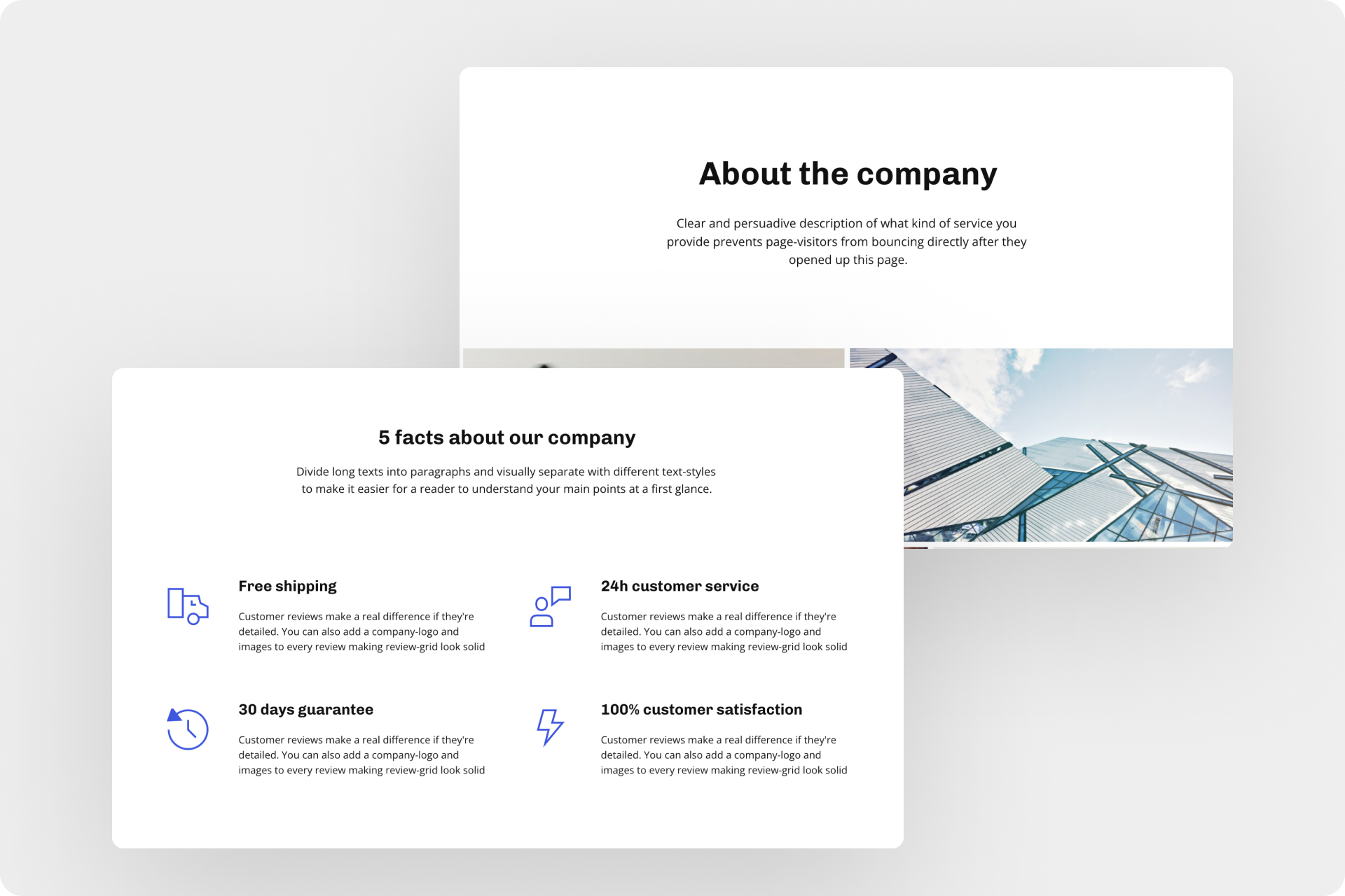
When creating a landing page, a founder's note or personal story can make a valuable contribution to help visitors identify with your offer and build trust. Through this personal insight, you can establish an emotional connection with visitors and convince them that you understand their problem and can provide the solution. Here are some tips on how to craft an effective founder's note:
- Explain your motivation: Share with visitors why you chose this offer and what personal drive you have to help them. Use authentic and honest words to express your passion and dedication to your offer.
- Highlight the positive change: Explain how your offer can positively impact visitors' lives or businesses. Describe the results they can expect and how their lives will improve by using your offer.
- Show that you're a real person: Let visitors know that there is a real person behind the offer. Share your own experiences, challenges, or successes that have shaped who you are today. This builds trust and authenticity.
- Use images and videos: Incorporate pictures or videos of yourself to establish a more personal connection. Show yourself in action or interacting with customers. Images can help visitors better identify with you.
Note: Also read our article "Storytelling: These are the 10 most important rules".
Conclusion
In summary, an impactful landing page is a vital tool for achieving sales success. It is crucial to carefully evaluate each element and consider whether it contributes to a persuasive sales conversation. If not, these elements should be removed or revised accordingly.
To ensure the effectiveness of your landing page, I highly recommend testing it and gathering feedback from real customers. This valuable insight will enable you to make adjustments and improve the conversion rate.
A well-crafted landing page that offers clear value to visitors and motivates them to take action will significantly increase conversions and attract customers successfully. Embrace a mindset of continuous optimization and improvement to maximize the potential of your created landing page.
Start with
Onepage for free.
It’s fast and enjoyable
Onepage is free to use. It’s not a trial version.
No credit card is required
