August 1, 2022
Create a successful thank you page and get better conversions
How to create a great thank you page and increase your sales

Create a successful thank you page and get better conversions
You may have read at least one of the following sentences before:
"You have successfully signed up for our newsletter "
"Thank you for your order "
"Thank you for your inquiry "
These phrases are classic phrases that are popularly used on so-called thank you pages.
After a visitor has completed a conversion action and, for example, filled out an online form and clicked on "Submit" or made a purchase in your online store, you can redirect them to a thank you page.
A thank you page is necessary to inform the user that their submission was successfully received and to let them know what the next steps are. For example, offering a discount.
With a thank you page, you can increase your sales and get better conversions.
And yet, most landing page owners still don't use a thank you page.
In doing so, operators miss the opportunity to build a bond with their customers, redirect them to another product, and in the best case, close (another) sale.
When creating such a page, however, you should keep a few basic things in mind. In this article, we'll show you how to create a successful thank you page. Afterwards, you will be able to put our tips into practice yourself.
1. What information belongs on a thank you page
After a successful purchase, the user is in a crucial phase. You have gained his trust, but a few seconds after the purchase, on a subconscious level, doubts set in. This phenomenon is called "cognitive dissonance". For a few seconds after the purchase, consumers ask themselves whether the purchase was really necessary, whether the product might be cheaper somewhere else, or whether the hoped-for benefits will actually materialize.
Now it is especially important to confirm your buyers in their purchase decision. You can do this with a thank you page. You reward the consumer for their trust and send the message that the purchase was the right decision. So essential to your page, as the name implies, is the word "thank you."
Tell your buyers what happens next.
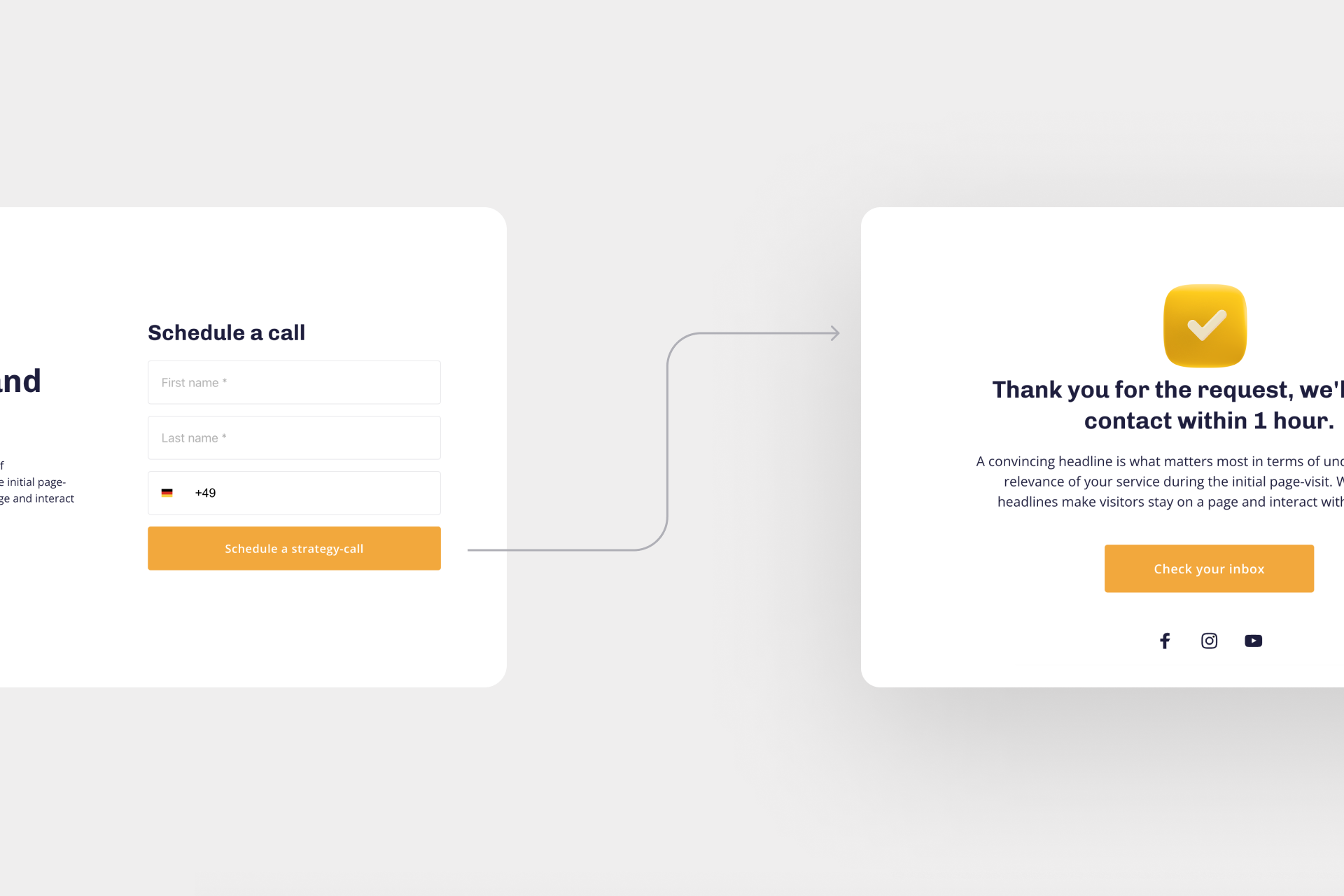
Let your visitors know that their form has been received, and tell them what the next steps are. If a visitor has subscribed to a newsletter, thank them and ask them to check their inbox to confirm their subscription.
Generally, these are the two most important aspects of creating a successful thank you page. Below we will show you what additional information you can include on your page.
2. Elements of a great thank you page
To create a great thank you page, you can use different elements. You don't have to and shouldn't place all the suggested elements on your page - 2-3 hints are enough.
Create a successful thank you page - 7 useful elements:
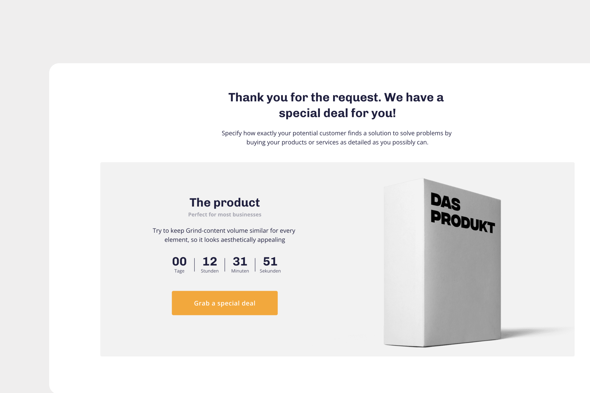
1. Offer additional products, services or discounts: Smart marketers use thank you pages as a platform to sell products that might be of interest to a buyer. For example, thank them for their purchase and offer discounted items or a special deal in the same move.
2. Offer a freebie: In addition to regular-priced products, you can also offer freebies. The customer will be especially happy if he receives a gift in addition to the actual purchase. This will build trust and customer loyalty.
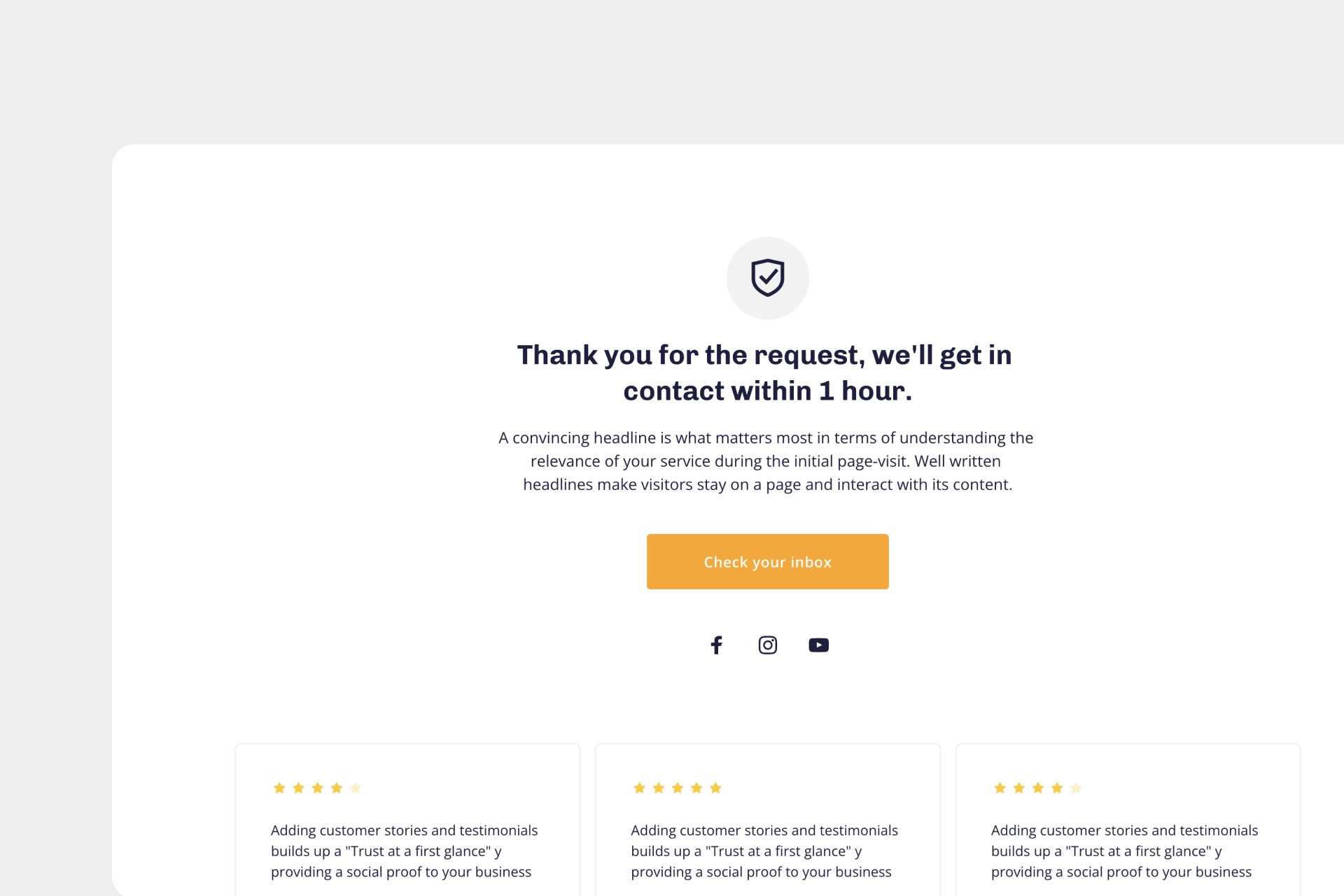
3. Add links to your social media: Social media is an additional point of contact between a brand and a satisfied customer. They help keep up with your new products, increase customer loyalty and can influence repeat purchases.
4. Get to know your users better: Another great option is to place a small survey on the thank you page. This way you get to know your users and can better help them find the right product in the future. On Onepage you can use our quiz template. For example, ask "why did you buy this product?" or "what product features are most important to you?".
5. Schedule: If your users have registered for a webinar or event, it makes sense to integrate the option "Add to calendar" on your page. This way, the appointment will not be forgotten.
6. Newsletter: Use your page to refer to your newsletter. The user has already shown that he is interested in the company or the products. In a successful email marketing you can now bind the customer to you in the long term.
7. Reviews: Another effective way is to place reviews from other customers on your site. This encourages the customer to make a purchase decision and triggers a positive feeling in him.
3. What makes a great thank you page
Customer value is key for each of the scenarios we've covered. If your text is too "sales-heavy" or the design is too flashy, your page might annoy rather than delight the reader. You should therefore be sensitive and think about what will really add value to your users.
5 tips to keep in mind when creating your thank you page:
- Get personal: On a thank you page, you should get personal. Build a relationship with your users. How to do this. Use photos or videos to convey emotions. Write a short personal text and say something about your company. At this point, our blog article "How to write convincing landing page texts?" can help you.
- Positive reinforcement: It's important to praise your customer on a thank you page and reinforce their buying decision. For example, you can congratulate your customers for buying the product. Also phrases like: "Welcome to our community" give a sense of exclusivity and security and make your buyers feel validated.
- Call-to-action: Be sure to include a call-to-action on your page. This lets users know what to expect next. Clear instructions show users how to proceed. Example, "Read my latest blog article now" or "Follow me on social media."
- "Less is more": Don't overload your page with too many elements. As a rule, you can remember that 2-3 elements/incentives are enough.
- Great Design: It doesn't matter how much time you invested in perfecting the content of your thank you page, if the design is not attractive enough, it will not attract the necessary attention. Therefore, make sure that your page looks appealing. Choose colors and fonts that match your business. Again, don't "overload" the design with too many colors or fonts. Learn more about this topic in our blog article "Your own landing page in just 5 steps".
Tip: On Onepage you can find templates for successful thank you pages that are already optimized for conversion.
Conclusion
Creating a thank you page can help you increase your sales and attract customers.
From a business perspective, creating such a page can be very effective. After all, if a particular page has the potential to drive higher conversions, why wouldn't you use it? Even if the thank you page is not directly part of the sales funnel, it can still have a positive impact on the performance of the entire website and drive higher conversions.
One way to create a great thank you page completely free of charge is with Onepage.
Start with
Onepage for free.
It’s fast and enjoyable
Onepage is free to use. It’s not a trial version.
No credit card is required
