April 9
How to use white space effectively on your website
A guide to clean, functional, and engaging web design
White space – also known as negative space – is one of the most important yet underrated elements in web design. But it's anything but “empty space”! White space improves readability, gives your site a clean look, and helps guide attention to what really matters. In this article, You’ll learn why white space is essential, how to use it properly, and which mistakes to avoid.
Why is White Space So Important in Web Design?
Good white space not only makes your website look better, but also function better. Here are some benefits:
✔ Better readability – Text that’s too tightly packed is hard to read. Spacing between lines, paragraphs, and letters makes reading easier and more pleasant.
✔ More focus on the essentials – Elements surrounded by white space naturally stand out. That helps draw attention to your key messages and calls-to-action (CTAs).
✔ Professional appearance – A well-structured website looks high-quality and modern. Big brands like Apple use white space to create a minimalist and elegant aesthetic.
✔ Easier navigation – Websites with enough breathing room are easier to use. Visitors find what they’re looking for faster.
Types of White Space – Micro and Macro
There are two main types of white space:
🔹 Micro white space: These are the small spaces between letters, words, lines, and paragraphs. Getting this right helps improve text readability and overall flow.
🔹 Macro white space: This refers to the larger spaces between major sections on your site – like between headers, content blocks, and footers. Macro space helps organize your layout and establish clear visual hierarchy.
How to Bring Calm & Clarity to Your Page
Here are a few practical tips to create the right white space on your site:
✅ Use spacing intentionally
Always leave enough room after headlines, images, and paragraphs. It brings structure and calm to your layout.
✅ Create visual groupings
Elements that belong together should also appear together visually. This makes it easier for users to scan and understand content.
✅ Isolate important elements
Buttons, headlines, or CTAs are more effective when they have room to “breathe.” It naturally highlights them.
✅ Balance over emptiness
White space isn’t just a blank void – it’s the stage that makes your content shine.
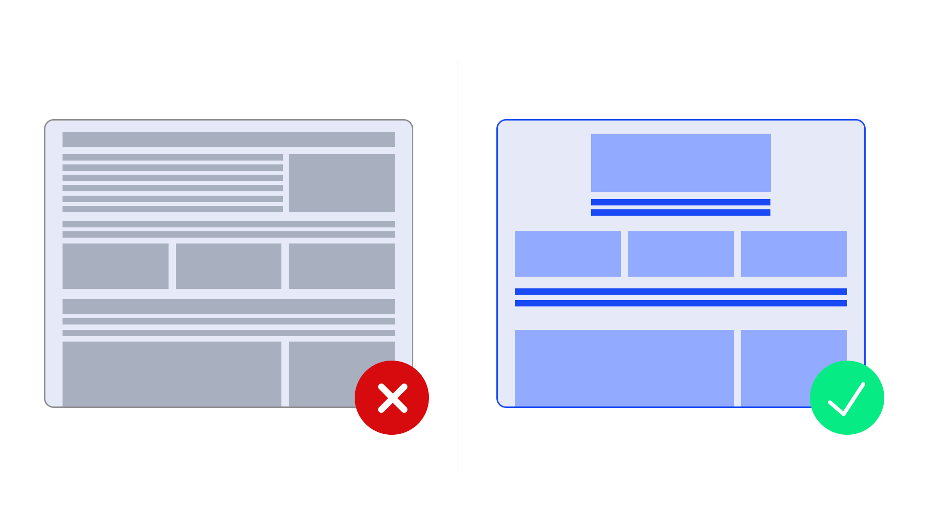
Common Mistakes When Using White Space
❌ Text blocks too tight – Hard-to-read content with no breathing room turns users away.
❌ Overloaded pages – Too many images, banners, or colors disrupt white space and overwhelm visitors.
❌ Too much space in the wrong spots – Pages that feel empty or unfinished can confuse users or reduce trust.
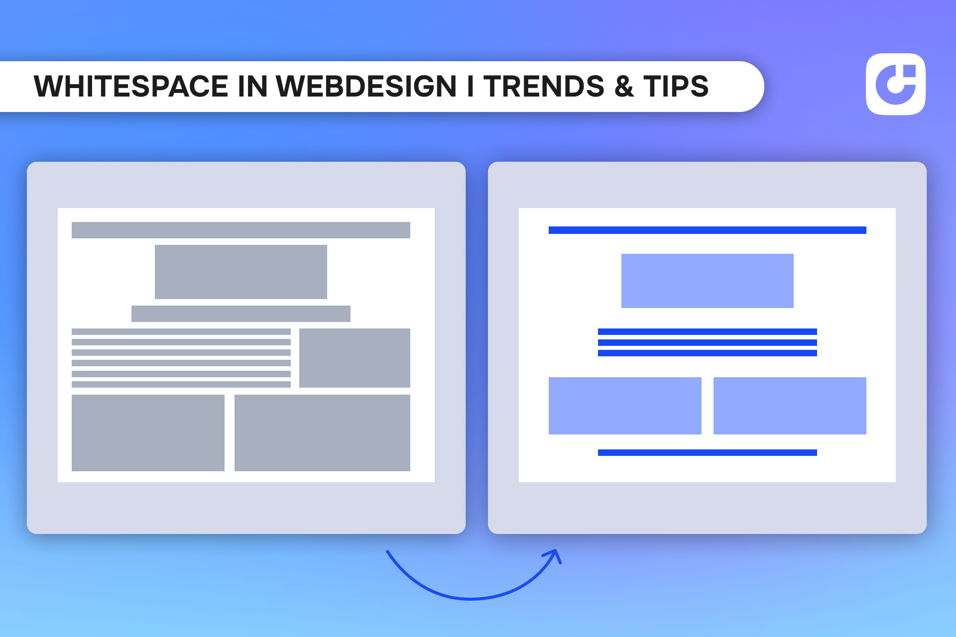
Before & After: What a Difference White Space Makes
One of the best ways to understand the power of white space is to see it in action:
➡ Before: A cluttered website with little spacing between text and images. Everything looks chaotic.
➡ After: A modern, structured layout with plenty of white space. Content is clearly separated, easier to read, and key elements immediately catch the eye.
Bonus: Tools to Improve White Space on Your Website
White space isn’t just about intuition – You can measure and optimize it! Here are some tools that help:
🔧 Useberry
Run quick user tests to see if people can easily find CTAs or menus. If paths feel unclear or too long, adding white space can improve orientation.
🔧 Figma + White Space Plugins
If You design in Figma, try plugins like “Whitespace Analyzer” or “Design Lint” to detect uneven spacing and tidy up your layout.
💡 Tip: Check your design on small screens or with a reduced viewport size – cramped areas will become much more obvious.
Final Thoughts: White Space Is More Than Just Empty Space
Used right, white space makes your website not only more beautiful but also more effective. It improves readability, highlights what matters, and creates a modern, professional impression. So don’t be afraid of empty space – give your content the stage it needs to stand out.
Now it’s Your turn: Take a fresh look at your site – are there areas that feel too crowded or tight? Maybe it’s time to embrace white space a little more.
Start with
Onepage for free.
It’s fast and enjoyable
Onepage is free to use. It’s not a trial version.
No credit card is required
