April 24, 2023
Website or landing page - What is the right choice for your business?
What is the difference and what is better suited specifically for your marketing?
Website or landing page - What is the right choice for your business?
Have you ever wondered what sets successful businesses apart from unsuccessful ones when it comes to their online presence? If you want to establish an online presence for your business, it's important to create a website that fits your specific goals and needs. Therefore, one of the most important decisions you will have to make is which option to choose: a complex website or a targeted landing page. But what's the difference, and which option is best for your business? In this article, you will find the answer!
By understanding the differences between a website and a landing page, you can develop a better online strategy that is tailored to your specific goals and needs. A well-thought-out online presence can help strengthen your brand, bring more traffic to your website, and ultimately lead to more sales or sign-ups. Therefore, it is crucial to understand the pros and cons of landing pages and websites and utilize them effectively to achieve your goals.
For businesses, this decision can often be a challenge, and understanding the differences between the two options can help you make the right choice. In this article, we will delve into the differences between a website and a landing page and help you make an informed decision about which option is best suited to your business and goals.
What is a landing page and how is it structured
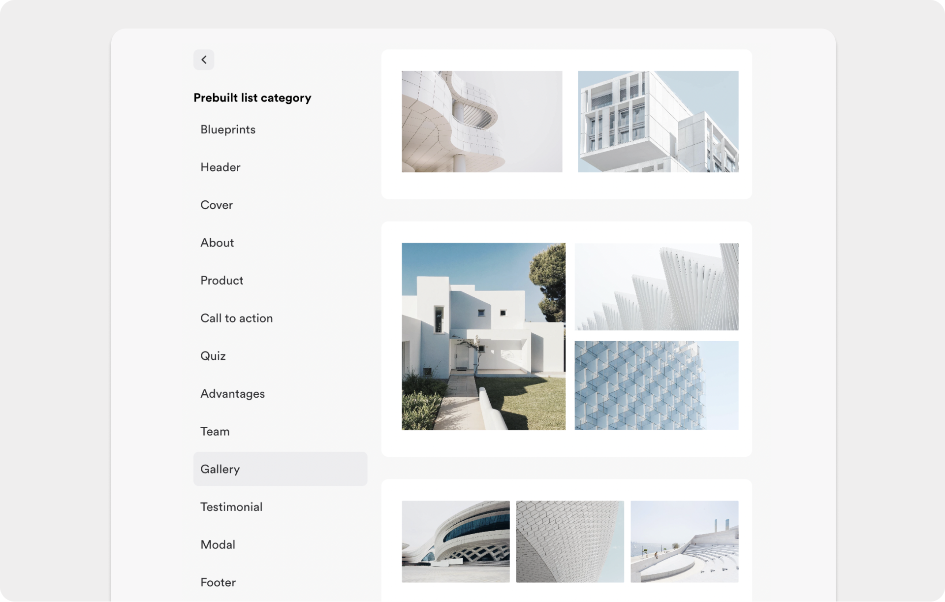
A landing page is a specially designed page with only ONE specific purpose. It is usually designed simply and has few distractions to focus the visitor on the desired action. A landing page is geared to a specific target group and has a clear message, as well as a clear call-to-action. It offers only limited information to avoid distracting the visitor.
The landing page usually consists of the following elements:
- Headline: The headline is the first thing a visitor sees on a landing page and is often crucial to the success of the page. A good headline should be short, concise, and appealing, in order to capture the visitor's attention and encourage them to continue reading. It is important that the headline communicates the page's message and clearly shows the offer or value for the visitor. A successful headline can motivate the visitor to stay on the page and take the desired action, such as making a purchase or signing up for a newsletter.
- Hero section: The hero section is the first section on a landing page and has an important function: it should attract the visitor's attention and encourage them to scroll or click further. The hero section usually contains a striking image or video (hero shot), a headline, and a brief description that communicates the page's or offer's message.
- Footer: The footer is the last section on a landing page and contains important information such as imprint, privacy policy, contact information, or links to other pages. The footer is often designed uniformly and also contains the copyright or trademark logo of your company. A well-designed footer contributes to user-friendliness and gives the visitor the feeling that the page is trustworthy.
- Hero shot: The hero shot is a striking image or video in the hero section that is intended to arouse the visitor's interest. The hero shot often shows the product or offer in an attractive and understandable way. A well-selected graphic or video can encourage the visitor to scroll further and thus increase the likelihood of a conversion. The hero shot should therefore be well selected and optimized in relation to the target group and the offer.
- Offer: The offer is the centerpiece of any landing page. It should be clear and precise, and show the visitor the benefits of your offer. The offer should be formulated in such a way that it addresses the needs of the target group and arouses their interest. It is important to keep the offer simple in order not to overwhelm the visitor and to give them a clear call to action. The offer, in combination with the call-to-action button, should lead the visitor to take the desired action, whether it's buying a product or signing up for a newsletter. A landing page can also have multiple offers, but it is important that each offer is geared towards a specific target group and communicates a clear message.
- Call-to-action button: The call-to-action button is a crucial element on a landing page. It is the button that the visitor should click on to take the desired action, such as making a purchase or signing up for a newsletter. The button should be striking and clearly visible to draw the visitor's attention to it. The label on the button should also be clear and concise to motivate the visitor to click on the button.
- Form: The form on a landing page is an important part of capturing visitors' contact information. It should be designed to be simple and easy to understand, so as not to overwhelm the visitor. The form should only contain the necessary fields, including name, email, and telephone number, if applicable. The form should also provide a clear call-to-action, such as submitting the form to receive a free download or sign up for a newsletter. As soon as you ask for more than three pieces of information, it's better to use an interactive quiz. It's also important to reassure the visitor that their data will be kept secure and not shared with third parties.
- Images: Images play an important role on a landing page to pique the visitor's interest and provide a visual impression of the offer. High-quality and appealing images can help make the offer more attractive to the visitor and increase the likelihood that they will take the desired action. However, images should not distract from the actual offer and should be in an appropriate proportion to the text on the landing page.
A landing page can also include additional elements that support the message and strengthen the visitor's trust, such as customer reviews, testimonials, or trust seals. Generally, a landing page is kept simple in design, so as not to overwhelm the visitor and to focus their attention on the offer and the call-to-action. The design should also be optimized for mobile devices, as an increasing number of users access the internet through their mobiles.
How do visitors get to the landing page?
There are different ways to direct visitors to a landing page. One particularly effective method is to use paid advertising, such as Google or Facebook Ads. These ads should be targeted to a specific audience to bring only relevant visitors to the landing page. It is crucial that the ads contain a clear message and a call-to-action. It is also important that the landing page lives up to the offer and advertising promise in the ads to achieve a high conversion rate.
Another way to bring visitors to a landing page is through email marketing campaigns. A well-designed email with a clear offer and call-to-action can lead the recipient to your landing page and result in a conversion. However, it is also important that the email is tailored to the target audience and the offer.
An example of how this can look in practice:
A software company creates an email marketing campaign to bring potential customers to a landing page offering a free demo version of their software. The email includes a brief description of the software tailored to the needs and pain points of the target audience, and a call-to-action that leads the recipient to the landing page.
On the landing page, the free demo version is prominently displayed, and the visitor is prompted to enter their contact information to download the demo version. The landing page also includes a short video that demonstrates the benefits and features of the software and conveys its value to the customer.
Through this email marketing campaign, the software company can target potential customers and bring them to a landing page that is tailored to their needs. The clear message and call-to-action in the email, as well as the focus on the benefits and features of the software on the landing page, can lead to a higher conversion rate and an increase in sales.
Social media marketing can also be used to bring visitors to a landing page. By sharing relevant content on social networks, the interest of the target audience can be piqued. The link to the landing page should be prominently placed.
What is a website and how is it structured
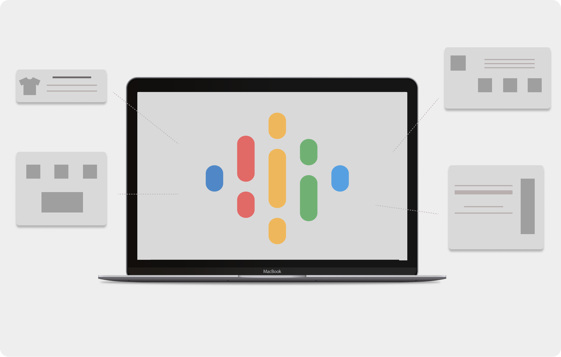
A website is a collection of web pages that together create a comprehensive online presence. It can consist of hundreds or even thousands of pages and often includes a lot of information, such as an "About Us" page, a blog, product descriptions, and much more. A website is typically very extensive and offers various of content and features.
In contrast to a landing page, which is focused on a specific action or offer, a website often has different goals and provides multiple actions for the visitor. Create a website to build brand awareness, increase visibility in search engines, or build a community.
The website is generally composed of the following elements:
- Homepage: The homepage is the face of the website and provides an overview of the company or organization. It should highlight the key points in short and concise sections and entice the visitor to explore further pages of the website. A clear structure and appealing visual design can help keep the visitor's attention.
- Menu/ Navigation: The menu or navigation bar is a central element of any website. It provides a list of links to the various pages of the website and allows visitors to navigate quickly and easily. A clear and easy to understand navigation can help the visitor find their way around the website and easily locate the desired information.
- About Us: The About Us page is a way to introduce the company or organization and share information about its history, vision, and mission. It can also include photos and information about the team and strengthen the trust and credibility of the company.
- Products and Services: Products and services pages provide detailed information about the products and services offered. They can help visitors better understand the benefits and features and make a purchase decision. There are usually customer reviews under each product.
- Blog: The blog is a way to consistently post content and generate interest from visitors. The blog on your homepage can cover various topics relevant to your business and provide added value to visitors. Regular blog posts can also help improve the website's ranking in search engines through SEO.
- Contact Page: The contact page allows visitors to get in touch with your company. It can include a list of contact information such as email addresses and phone numbers, as well as a contact form that allows visitors to send a message quickly and easily. A clear and concise contact page can strengthen the trust of visitors and increase the likelihood that they will become paying customers.
A professional agency can help in creating a website and ensure that all elements are optimally integrated to create a successful website.
A website typically offers more opportunities for interaction with the visitor than a landing page, such as comment functions, contact forms, or live chats. It is also an important tool for online presence and provides the opportunity to strengthen the image and credibility of a company or organization.
How do visitors get to the website?
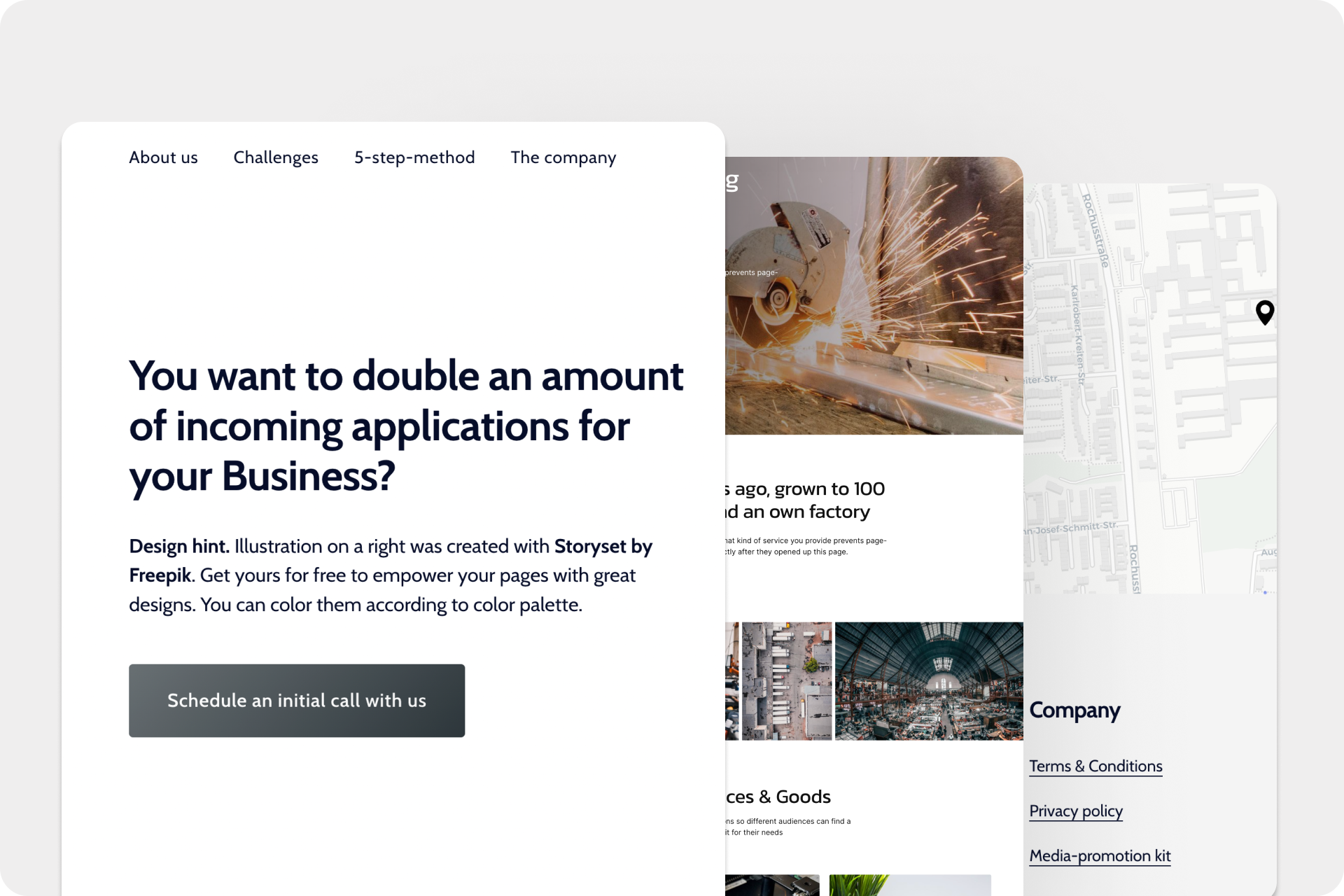
There are different ways in which visitors can come to a website. One of the most common ways is through search engines like Google or Bing. When someone searches for a specific topic, relevant websites are displayed in the search results and the user can click on the link to the website.
Another way is through linking on other websites. If a website has interesting and relevant content, other websites can link to it and attract visitors to the website.
Social media platforms like Facebook, Twitter, or Instagram can also be used to direct visitors to the website. If companies or organizations are present on social media platforms and share content, users can click on the link to the website and visit it.
In addition, online advertising can be used to increase the visibility of a website. For example, Google Ads or Facebook Ads can be used to specifically target users and attract attention to the website.
It is important that a website is optimized for search engines to appear as high as possible in the search results and attract more visitors. In addition, websites should be updated regularly to remain interesting and relevant to visitors.
An example of how a company can successfully use a website could look like this:
A small family business that produces and sells handmade soaps operates its own webshop where they showcase and offer their products for purchase. To attract more visitors to their created website and increase sales, the company takes several steps:
- Search engine optimization: The company ensures that their website appears as high as possible in the search results for relevant search terms such as "handmade soaps" or "sustainable soaps". For this purpose, targeted keywords are used in the meta-information and on the website itself.
- Social media marketing: The company uses social media platforms like Instagram and Facebook to promote their products and direct visitors to their website. They regularly post appealing pictures and descriptions of their soaps and link to their website.
- Online advertising: The company uses targeted advertising campaigns on Facebook and Instagram to attract even more users to their products and their website. The ads contain clear messages and call-to-actions that lead the user to the website.
- Website updating: The company ensures that the website is regularly updated by adding new products and special offers. They also ensure that the created website is appealing and user-friendly.
Through these measures, the company can increase its visibility on the internet and bring more visitors to their website. This can lead to higher sales and stronger customer loyalty.
When should you use a website and when should you use a landing page?
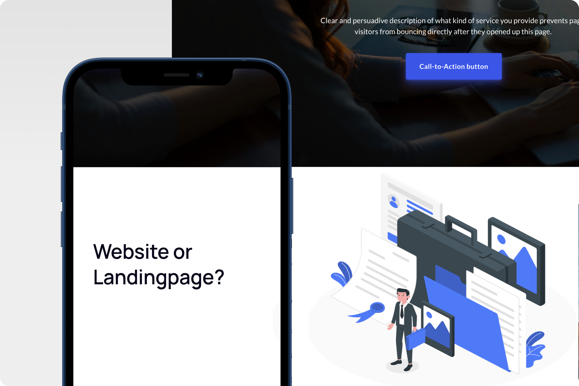
Landing pages and websites have the common goal of engaging visitors and building a strong connection. But which option is more effective for marketing? To achieve conversions, both need to be professionally designed and strategically deployed. In addition, the optimal display on all devices should be ensured. Now, you will learn which option is better for you!
A landing page is the best choice when you want to ask visitors to take a specific action, such as making a purchase or signing up for a newsletter. It is also appropriate if you have a time-limited offer or want to target a specific audience. A landing page should have a clear message and a call-to-action and be tailored to appeal to a specific target audience.
Creating a website makes sense, however, if you want to provide general information about a company, organization, or topic. A website should provide all the necessary information that a visitor needs to make a decision. Complex websites are especially common among online shops that offer different products for different target groups. It is important that the website is user-friendly and has clear navigation to make it easier for visitors to find the desired information.
An example of when companies should use a website and when they should use a landing page could look like this:
An online bike shop that sells bicycles has its own website where it presents and sells its products. The online shop now wants to start a special promotion and advertise a specific bicycle brand.
In this case, the online shop could use a landing page to specifically draw visitors' attention to this promotion and the advertised brand. The landing page would focus on the special promotion and the advertised brand, containing a clear message and a call-to-action to encourage visitors to make a purchase.
On the other hand, the online shop would continue to operate its website, where it presents its entire range of products. Here, it would focus on a broader target group and present its bicycles and accessory products in general.
Overview of websites and landing pages:
- Websites are extensive and provide a wide range of content and functions.
- Landing pages are designed for a specific task, have a clear message, and a call-to-action.
- A landing page is ideal for guiding visitors to take a specific action, such as making a purchase or signing up for a newsletter.
- Creating a website makes sense for providing general information about a company, organization, or topic. Or when multiple offers are to be provided for different target groups.
The biggest differences between a website and a landing page are their purposes and their target audiences. A created website is intended to convey general information about a company, organization, or topic and to establish trust with visitors. It aims to build a relationship with visitors and provide them with a variety of information and resources.
In contrast, a landing page has a specific goal, usually to persuade the visitor to take a particular action. It is focused on a specific target audience and has a clear message and call-to-action. A landing page is usually very targeted and specific, offering limited information to avoid distracting the visitor.
Another important distinction is the type of traffic that a website or landing page receives. A website typically receives broad traffic from various sources such as search engines, social media, direct traffic, and others. A landing page, on the other hand, is created specifically for a specific marketing campaign and only receives the traffic generated by that campaign.
What is the right choice?
Ultimately, the choice between a website and a landing page depends on the marketing goals you are pursuing and the type of traffic you want to attract. If you want to provide general information about your company and appeal to a broad audience, then you should create a website. If you expect a specific action from a particular target audience, then a landing page is better suited.
Professional design is crucial when it comes to websites and landing pages. Only then can the trust of visitors be gained and the desired result achieved. A website must not only be easy to navigate but also provide relevant information in an understandable manner. With landing pages, it is crucial that they offer a clear offer with a convincing message and a clear call-to-action.
Conclusion
Websites and landing pages are like yin and yang – different, yet together they form a perfect unit. While websites provide a comprehensive online experience that conveys general information about a company, organization, or topic, landing pages are focused on a specific action and have a clear goal and call-to-action.
Although websites and landing pages have different purposes, they can both be effective marketing tools. A well-designed website can build trust with visitors and provide them with a comprehensive understanding of the company or organization. Conversely, a landing page can convey a targeted message and encourage the visitor to take a specific action.
When professionally designed and strategically used, websites and landing pages can generate interest and build a positive relationship with visitors. Therefore, companies and organizations should include both websites and landing pages in their online marketing strategy to fully capitalize on their potential.
The best way to try it out for yourself is to create your first page with Onepage. With our software, you can easily, quickly, and most importantly, create your own page for free. Simply follow the link to sign up and maybe even publish your first page today!
Start with
Onepage for free.
It’s fast and enjoyable
Onepage is free to use. It’s not a trial version.
No credit card is required


