April 24, 2023
Impress your visitors: 6 tips for a perfect hero section
6 tips for a perfect hero section: Impress your visitors with targeted use of images, texts, and CTAs
Impress your visitors: 6 tips for a perfect hero section
Imagine walking into a store and being greeted by a friendly salesperson. How important is that first impression to you? The first impression your website makes on your visitors is just as important, and there's a specific area that stands out: the hero section.
The hero section is the first thing visitors see when they visit your website. A well-designed hero section can help keep visitors on your site longer and learn more about your products or services. But how do you create an effective hero section that excites visitors and increases your conversion rate?
In this article, we'll show you why the hero section is the most important area of your website and how to create a hero section that impresses your visitors. We'll give you tips on how to convey your brand or company's message succinctly in the hero section, and how to encourage visitors to learn more about your products or services with a clear call-to-action button.
Ready to perfect your first impression? Keep reading to discover how an effective hero section can pique your visitors' interest and lead your website to success!
What is the hero section and why is it so important?
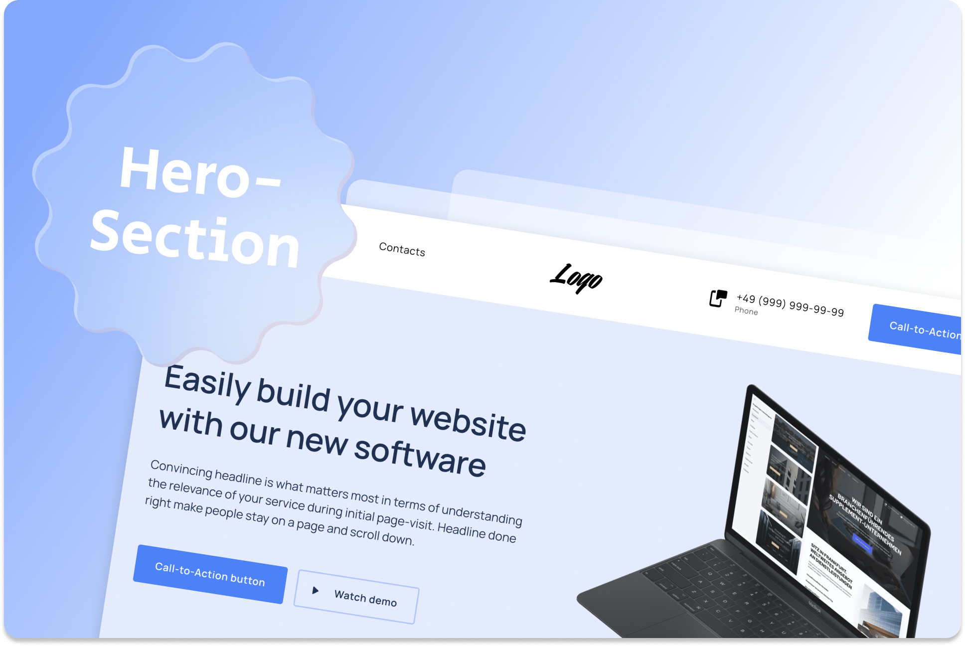
When you visit a website, what is the first thing you see? That's right, the hero section! This area on your website or landing page is an absolute must if you want to capture your visitors' interest. It's the first impression visitors get of your brand or company, and it's therefore crucial that you design your hero section to be attractive and inviting.
The hero section typically consists of a large header image, a headline, and a call-to-action button. The images and text should be clear and concise, conveying the message of your brand or company. The design should grab the visitor's attention and make them want to learn more about your website.
Why is the hero section so important?
Because it's the area that determines your visitors' first reaction to your website. If your hero section is poorly designed, visitors may quickly leave your website. However, an effective hero section can help to retain visitors and increase your website's conversion rate.
By placing a clear call-to-action button in your hero section, you can encourage visitors to learn more about your products or services. A well-designed and effective hero section can help to strengthen your brand and generate interest from your visitors.
The hero section is an essential part of your website that can help your business succeed. It's the first area your visitors see, and it's therefore crucial that you design it to be attractive and inviting. With a well-designed and effective hero section, you can retain your visitors and increase your conversion rate.
6 Tips for creating an engaging hero section
An engaging hero section is key to the success of your website. But how do you actually create an effective hero section? Here are some tips and tricks that can help:
#1 Choose a meaningful image or video:
The image or video in the hero section should have a clear connection to your brand or company. Therefore, use high-quality images or videos that will excite your visitors and grab their attention. For example, if you have a travel company, you could use a picture of a breathtaking beach or landmark to awaken your visitors' wanderlust and increase their curiosity. Make sure that the image or video is not too cluttered and supports the message of your brand or company.
#2 Use eye-catching colors:
Colors have a strong effect on our emotions and perception. Therefore, when designing your hero section, it is important to use colors that represent your brand or company and harmonize well with each other., it is therefore important to use colors that represent your brand or company and harmonize well with each other. Do not use too many different colors, as this can quickly appear overloaded and distract visitors' focus from the actual message.
For example, if you are creating a website for a health and fitness company, you could use colors like green or blue that are associated with a healthy and active lifestyle. A highlighted call-to-action button in red can also be effective as this color can trigger action readiness.
It is important that the colors you choose also evoke the desired emotions and associations in your visitors. A well-thought-out color selection can help spark visitors' interest and curiosity, motivating them to stay on your website.
Note: Also, read our blog post "How to make your LP design a success - avoid these 20 design fails”.
#3 Use clear fonts:
A clear and legible font is essential for an effective hero section. After all, visitors should be able to quickly and easily understand your message. Therefore, choose a font that is easy to read and fits your brand.
A good example of this is the hero section of Dropbox. The company uses a clear, sans-serif font that is easy to read and still looks modern. The font color is white and stands out clearly from the dark background, ensuring good readability. The clear font and simple design focus attention on the call-to-action button, encouraging visitors to sign up.
Another example is the hero section of Apple. The company uses a thin, elegant font that suits their brand well. The font color is white and stands out from the background. The font size is large enough to be easily legible without overloading the rest of the hero section. The font supports the minimalist design of the hero section and directs focus towards the product.
#4 Avoid too much text:
It is important to find a balance between conveying your brand's message and an overloaded hero section. Too much text can overwhelm visitors and cause them to leave the page quickly. Instead, use short, concise headlines or slogans that convey your message and pique visitors' interest.
A good example of a hero section with little text is also the website of Apple. On their homepage, they use a large image loop with short headlines and slogans promoting their products and services. The use of images and short texts attracts visitors' interest and encourages them to explore more.
Note: At this point, our blog post "How to Write Website Texts that Convince?"
#5 Use a clear call-to-action button:
A call-to-action button is an important part of your hero section. It should encourage visitors to take action on your website. The button should be clearly visible and contain a clear call-to-action, such as "Buy Now" or "Sign Up Now". Choose a color that stands out from the rest of the color palette and is easily visible.
A practical example of this could be an online store for fitness clothing. In the hero section, you can use a striking image of a sporty person in the appropriate clothing and add a headline like "Improve Your Training with Our Premium Fitness Clothing". The call-to-action button could say "Buy Now" and have a noticeable color like orange or red to grab the visitor's attention. By using these design elements, you can encourage potential customers to buy your products and explore your website further.
#6 Pay attention to a good layout:
A well-designed hero section should not only be visually appealing but also have a clear structure so that your visitors can quickly and easily find what they are looking for. The layout is a crucial factor in achieving this. A clear design with sufficient spacing between the individual elements creates a clear structure and makes navigation easier.
A good example of a successful hero section is the website of Mailchimp. Their homepage features a well-structured hero section consisting of a concise slogan and a call-to-action button. The clear separation of the individual elements and the sufficient spacing make the hero section very clear and inviting. Additionally, the page is fully responsive, meaning it displays optimally on all devices.
What does it look like in practice?
An online shop for handbags wants to convey the feeling of luxury and elegance to its customers. The entrepreneur plans to create a hero section on the homepage that immediately takes visitors into a world full of high-quality handbags and luxurious accessories. To achieve this, they choose an image that highlights the beauty and elegance of their handbags and captures the visitors' attention.
Using appropriate colors and fonts that reflect the upscale image of their brand, they create a hero section that makes visitors feel like they are diving into a world full of elegance and style. Instead of boring texts, they rely on a meaningful headline that piques visitors' curiosity and motivates them to explore the exclusive collection of handbags. By following these tips for designing an appealing hero section, the entrepreneur was able to create an impressive visual experience for their customers and also generate interest in their products.
By applying our tips, you can create an appealing hero section that will captivate your visitors and encourage them to learn more about your brand or company. A well-designed hero section can make a difference and significantly influence the success of your website.
3 Examples of successful hero sections
Are you wondering what successful hero sections look like and what makes them so effective? If so, you've come to the right place! In the following section, we'll show you some websites that excel with their hero sections and explain why they are so successful.
#1
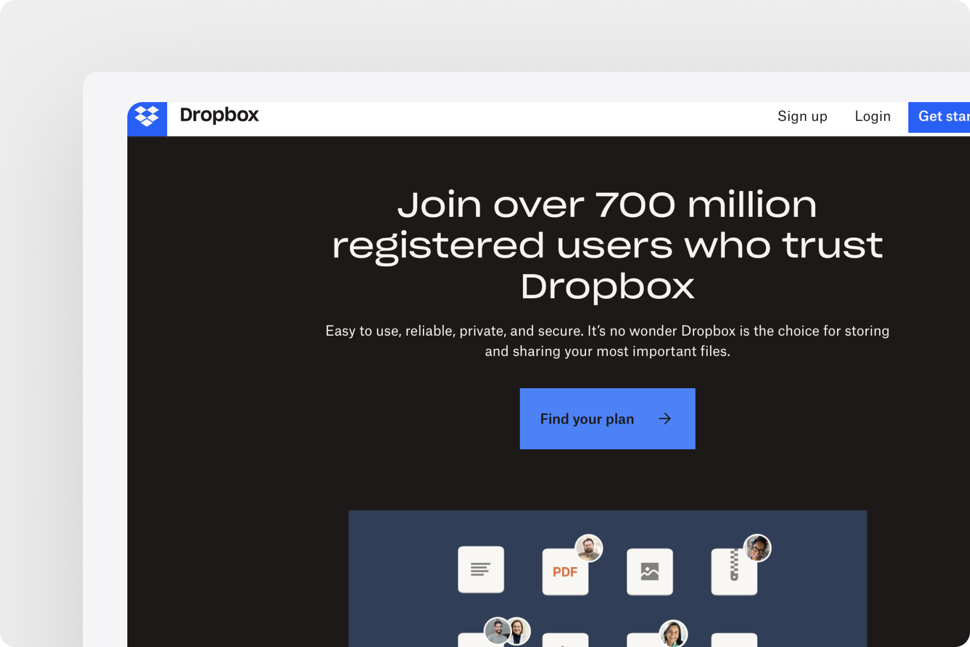
One example of a successful hero section is the website of Dropbox. The hero section displays an animated video that highlights the company's main product - the cloud storage solutions. The video is accompanied by a clear headline that summarizes the benefits of using Dropbox. The call-to-action button is also prominently placed, encouraging visitors to try out Dropbox's services. The hero section is kept simple and straightforward, which helps visitors not to get overwhelmed and focus on the essentials.
#2
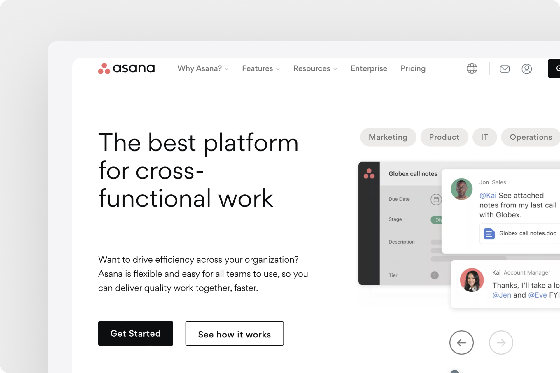
An example of a successful hero section is the website of Asana. The page features a large image with a clear headline and a call-to-action button that encourages visitors to sign up and try Asana. The hero section is very minimalist and focuses on the product's benefits. Asana vividly demonstrates how easy and effective it can be to organize projects and manage teams.
#3
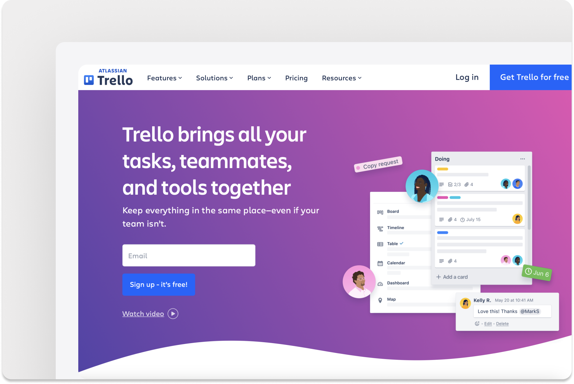
Another example of a great hero section is the website of Trello. The page displays a large image with a clear headline and a call-to-action button that encourages visitors to sign up and try Trello for free. The hero section is visually appealing and shows in an illustrative way through the graphics used, how easy it can be to organize tasks and projects. Trello focuses on the benefits of the product and encourages visitors to try it out.
These examples show that a successful hero section does not necessarily require many elements or much text, but rather that the clear and concise presentation of relevant information is crucial. A clear headline, a prominent call-to-action button, and visually appealing design are essential for success.
Save time and still generate conversions!
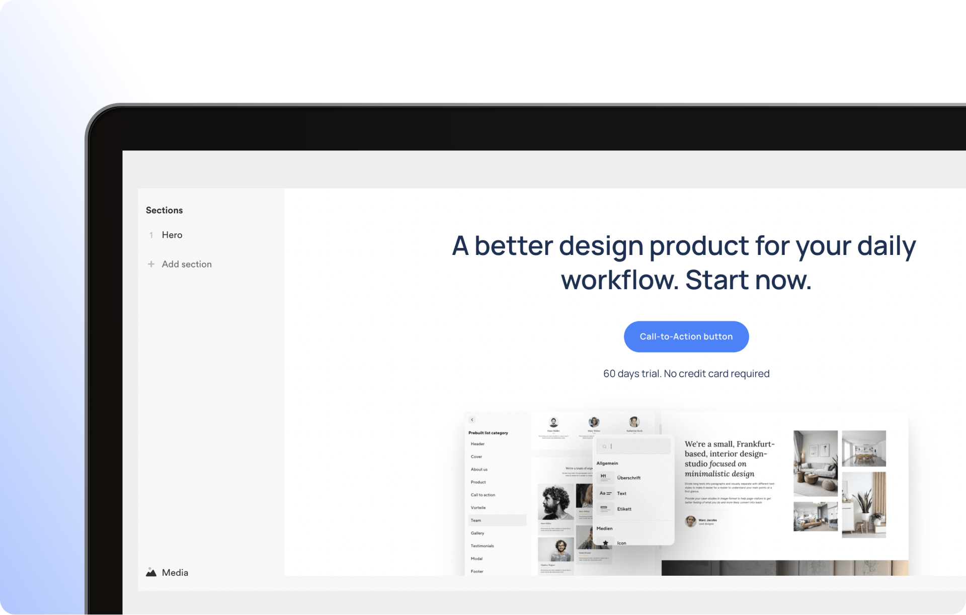
It's amazing how easy it can be to create a successful Hero-Section when you use the right tools. At Onepage.io, we offer pre-made templates that allow you to create an attractive and effective Hero-Section without much effort.
The templates are carefully designed to achieve a high conversion rate while also having a professional and appealing look. With just a few clicks, you can choose a template that matches your brand and products or services, and then insert your own content and data.
Of course, it's important to customize the template to your own needs in order to ensure a consistent presentation of your brand and effective communication with visitors. This includes using appealing images, a clear headline, an inviting layout, and a clear call-to-action button.
Hero-section on mobile devices
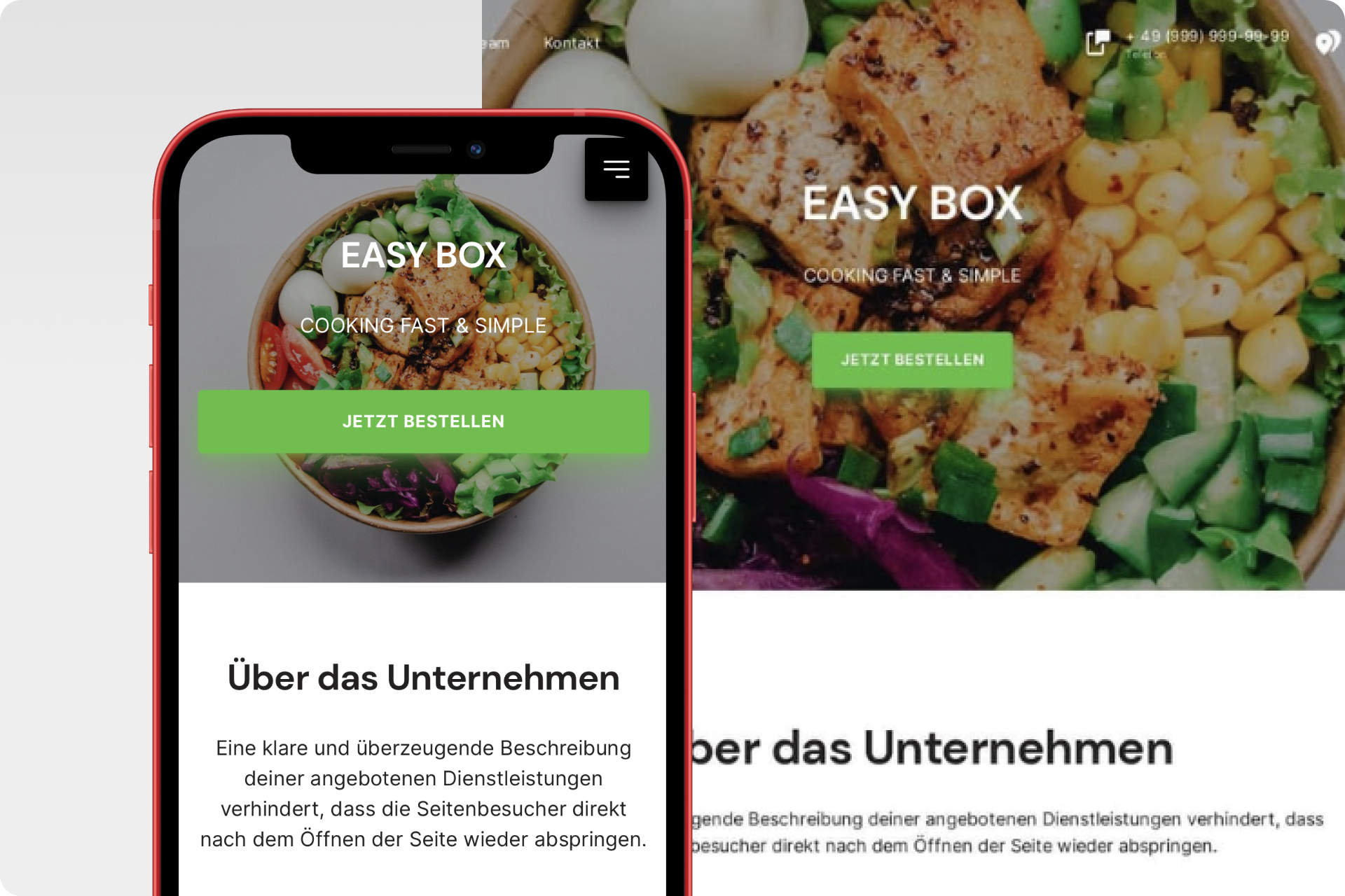
You've designed a great hero-section for your website, but have you also considered how it looks on mobile devices? More and more people are using smartphones and tablets to access websites, so it's crucial that your hero-section works well on these devices too.
A successful hero-section on mobile devices requires a bit more planning and consideration than the desktop version. Since screen space is limited, content and elements must be arranged to be easily readable and navigable on small screens.
An important consideration is the size and placement of images and text. Large images and too much text can be overwhelming on mobile devices, so it's advisable to optimize them and keep them focused on the essentials. The placement of call-to-action buttons should also be strategically reconsidered to ensure smooth navigation.
There are also some technical aspects to consider, such as compressing images to optimize page load time and using responsive design to ensure the Hero-Section works well on various devices and screen sizes.
At Onepage.io, all pages and every single template is already optimized for mobile view. You don't have to worry about your pages "breaking" and shattering on an end device.
How to measure and optimize the performance of the hero section
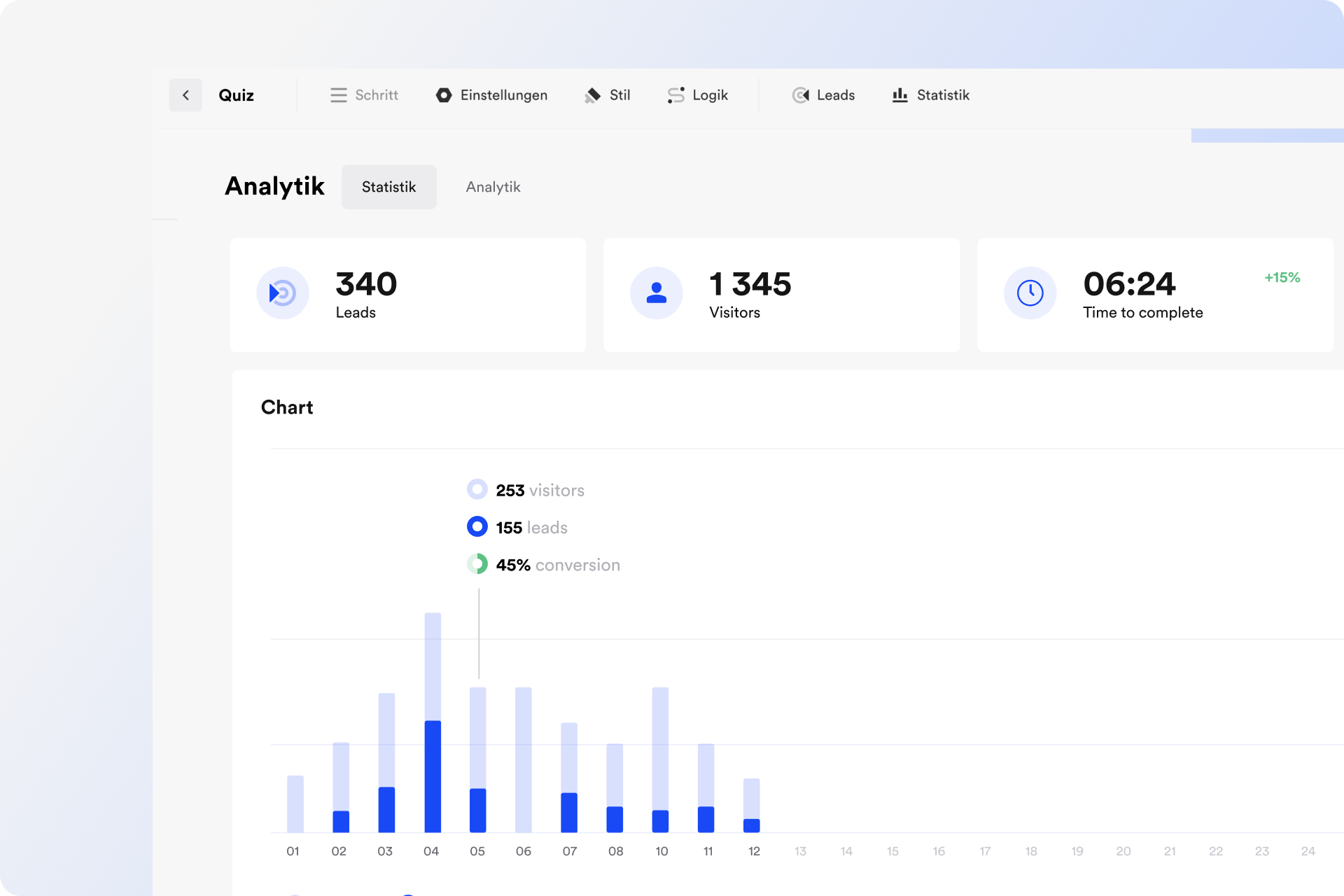
You want to ensure that your website's hero section not only looks appealing but also effectively contributes to increasing your conversion rate? One way to achieve this is by measuring and optimizing the performance of your hero section.
There are various tools and techniques you can use to measure the performance of your hero section. One simple way is to use analytics tools such as Google Analytics to measure the conversion rate of your hero section. For example, you can measure the number of clicks on your call-to-action button or the duration of visitors on your website.
Another helpful tool to optimize your hero section is A/B testing. This involves testing one version of your hero section against an alternative version to determine which version works better and generates more conversions. Different colors, images, or texts can be tested to find the best version for your target audience.
Another way to optimize your hero section is to reduce its loading time. A slow loading time can make visitors impatient and leave the page before even seeing the hero section. To avoid this, ensure that images and other elements in the hero section are optimized, and their file size has been reduced.
By regularly measuring and optimizing the performance of your hero section, you can ensure that it not only looks appealing but also effectively contributes to increasing your conversion rate.
Conclusion
The hero section is the first impression a visitor gets from your website. Therefore, it's essential to make it visually appealing, inviting, and clear in conveying your brand message. A well-designed hero section can encourage the visitor to explore more on your website and eventually lead to a conversion. To create an effective hero section, use high-quality images, a clear and concise headline, and an inviting call-to-action button.
Use the best practices discussed in this article to ensure that your hero section is visually appealing and increases your conversion rate. Remember to regularly check and optimize the performance of your hero section to ensure that it remains effective and impresses your website visitors.
Try it out yourself and create your first hero section with Onepage. With our software, you can easily, quickly, and above all, create your page and of course, your own hero section for free. Just follow the link to sign up and maybe even publish your first page today!
Start with
Onepage for free.
It’s fast and enjoyable
Onepage is free to use. It’s not a trial version.
No credit card is required
